
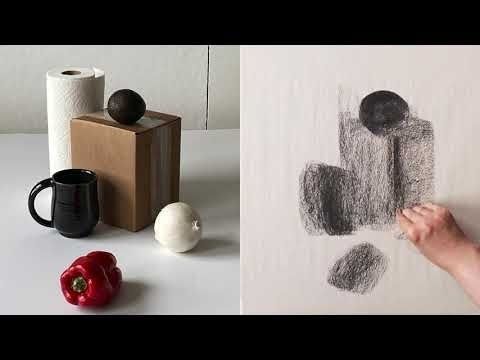
Before Detail: How Mastering Value Scales and Planar Lighting Builds Real Form
The Architecture of Light on Form
Many drawings become busy before they become solid. The artist adds a polished highlight to the cheek, a pattern to the fabric, or a soft gradient across a shoulder, yet the underlying mass remains uncertain. This happens when value is treated as a cosmetic rendering stage rather than as the structural blueprint of the image. Before surface detail can persuade the eye, the drawing must establish what turns toward the light, what turns away, and how each part occupies space.
Early embellishment cannot compensate for undefined geometry. Soft blending may produce an attractive atmosphere, but without a clear volumetric plan it often dissolves the planes that make a form legible. A more reliable approach begins with measured tonal relationships and deliberate lighting decisions. In that sense, value is not simply lightness or darkness on paper. It describes physical mass, the orientation of a surface, and the spatial clarity that allows a viewer to feel the object rather than merely recognize its outline. Even a simple study of an egg or folded cloth can benefit from the same discipline found in a carefully constructed value scale exercise.
Calibrating the Palette with Measured Value Scales
A value scale is often dismissed as a beginner”s warm-up, but it is more accurately understood as a calibration instrument. It trains the eye to distinguish neighboring tonal steps and trains the hand to reproduce those distinctions consistently. A well-made scale gives the artist a private reference system: it clarifies how dark the medium can become, how bright the paper can remain, and how evenly the intermediate values can be arranged. This is especially important because graphite, charcoal, ink, and digital tools each compress or expand the available range in different ways.
Constructing a scale also exposes habits that remain hidden in a finished drawing. Uneven jumps between tones reveal where contrast is being overused, while noisy patches indicate uncontrolled pressure or texture. A nine-step scale, associated with the system developed by Denman Ross in 1907, offers fine tonal distinctions, but a smaller range is often more useful during a structural block-in. Five values can be enough to describe a rounded object clearly: light, light halftone, middle, shadow, and deepest accent. As control improves, additional steps can be introduced without allowing the drawing to become muddy.
Think of the scale as a limited palette rather than a catalogue of every possible gray. Restriction creates hierarchy. When every area receives a different strength of shading, the eye has difficulty deciding what matters. A disciplined five-to-nine-step range keeps major light and shadow families intact, then reserves the darkest tones for structural emphasis. Useful principles include:
- Set the lightest and darkest values before filling the middle range.
- Space intermediate tones so that each step is visibly distinct.
- Keep the darkest value selective rather than spreading it across the drawing.
- Compare the drawing to the scale frequently instead of trusting memory.
- Use smooth, controlled marks where a continuous surface is intended, and sharper transitions where a plane changes.
The value scale is therefore both a seeing exercise and a planning device. Before beginning a portrait, still life, or figure, decide whether the image will remain high-key and delicate or move toward a dramatic full range. Such a decision prevents accidental tonal drift. It also saves time, because the artist can solve the range and hierarchy before committing to complicated textures or local color.
Planar Analysis and the Structural Planes of Light
Look closely at an organic form and its apparent smoothness begins to reveal a sequence of turns. A cheek moves from front plane to side plane; a pear narrows through a series of subtle changes in direction; a folded sleeve breaks into ridges, troughs, and broad transitional surfaces. Planar analysis makes these changes visible by temporarily translating complex curves into connected, intentional planes. This does not mean making every subject look mechanical. It means asking where the surface changes direction and how that change alters the light.
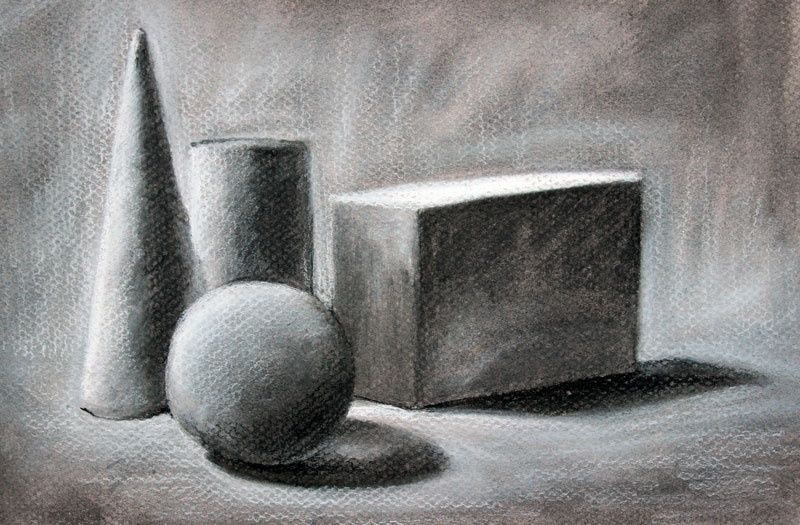
The physics is direct. A plane facing the primary light source receives more illumination than a plane turned obliquely away from it. A plane facing away enters the shadow family, while a plane angled toward the ground may become darker even when it remains close to another illuminated surface. The following comparison is not a rigid formula, since light size, reflectivity, and surrounding surfaces matter, but it provides a practical starting structure:
| Plane orientation | Likely light response | Useful value assignment |
|---|---|---|
| Directly facing the light | Strong illumination and possible highlight | Lightest value or light halftone |
| Turning slightly from the light | Reduced illumination with clear form change | Middle-light value |
| Side-facing or oblique plane | Moderate illumination and stronger modeling | Middle value |
| Turning decisively away | Entry into the form-shadow family | Shadow value |
| Occluded plane or contact area | Little direct light, often reinforced by surrounding blockage | Deepest accent, used sparingly |
In practice, begin with large planes rather than small anatomical or decorative information. A toy dinosaur, plaster cast, shoe, fruit, or folded cloth can all be studied this way. Establish the silhouette, identify the main directional changes, and assign broad values before refining the form. This analytical stage may initially feel less expressive than free shading, but it gives the drawing a dependable skeleton. Later marks can soften, exaggerate, or partially conceal the planes without losing their underlying logic.
The Anatomy of Edges in Communicating Spatial Volume
Edges are not merely borders; they are signals about how surfaces meet and how attention moves through an image. A hard edge is crisp and decisive, often useful where two planes intersect or where a cast shadow has a clear boundary. A firm edge is controlled but slightly less severe. A soft edge spreads the transition across a small area, supporting a rounded turn. A lost edge becomes so close in value to its surroundings that the boundary nearly disappears, allowing the viewer to infer the form rather than receiving every contour explicitly.
Edge quality should follow the behavior of the form. A box can carry several hard or firm transitions because its planes change abruptly. An egg requires broader, quieter gradations because its surface turns continuously. A cast shadow may begin with a relatively firm edge near the object and become softer as it travels across the ground, depending on the size and distance of the light source. Value contrast also affects perceived sharpness: neighboring shapes with similar values produce a subdued boundary, while a strong light-dark difference makes the edge appear more prominent.
Uniform outlines flatten a drawing because they give every boundary equal authority. They prevent the viewer from distinguishing between a plane intersection, a turning contour, a distant edge, and a shadow boundary. A more articulate edge vocabulary might include:
- Hard edges for plane breaks, sharp cast shadows, and focal accents.
- Firm edges for clearly described contours that remain integrated with the form.
- Soft edges for gradual curvature and atmospheric transitions.
- Lost edges where form recedes, values merge, or attention should be released.
Edge control is especially valuable in drawings with limited color, because it creates variety without requiring additional hues. A soft graphite transition can describe the turning of a forehead, while a narrow dark accent can clarify the meeting of a handle and a cup. The goal is not to blur everything that is rounded or sharpen everything that is structural. The goal is to make the viewer feel the rate and direction of each change in surface.
A Methodical Workflow for Building Form Before Detail
A dependable workflow postpones texture until the drawing can survive without it. This order resembles the way a sculptor establishes a mass before carving small features. Planar analysis is useful here because it can organize both observation and invention, whether the subject is a figure, animal, object, or imagined design. Work from large relationships toward small ones, and judge every later decision against the initial light structure.
- Block in the major spatial silhouettes. Establish the outer contour, the largest internal divisions, and the position of the object in its surrounding space. Choose a single primary light source and keep its direction consistent.
- Group the major light and shadow families. Use flat local values to separate illuminated planes from form shadows and cast shadows. Resist the urge to model every transition immediately.
- Refine secondary planes and turning forms. Introduce intermediate values where a surface rotates gradually. Use hard, firm, soft, and lost edges deliberately so that the drawing communicates both structure and depth.
- Introduce selective texture at focal transitions. Add pores, fabric marks, wood grain, metal reflections, or other surface information only after the form and lighting remain convincing in simplified form.
At each stage, step back and reduce the image mentally to a thumbnail. If the large light and shadow pattern still reads, the construction is working. If the drawing depends on tiny accents to appear dimensional, return to the previous stage and repair the major value relationships. Texture has its own visual language, but it cannot replace structure. Leather, skin, metal, and fabric become believable only when their marks follow a surface that already turns convincingly through space.
A useful test is to squint at the drawing or view it at a distance. Fine details should disappear while the primary masses remain. Another test is to convert the study into five values, either physically or digitally. This reduction reveals whether the focal point is supported by contrast and whether the shadow family has been kept coherent. Such checks may seem methodical, but they protect the drawing from the seductive noise of premature finish.
Bring Sculptural Mass to Your Daily Sketchbook Practice
The essential shift is from cosmetic shading to architectural lighting. Instead of asking which mark will make a surface look interesting, ask which plane is turning, which value family it belongs to, and how the edge should behave at that transition. This mindset does not eliminate expressive mark-making or material specificity. It gives those qualities a stable stage on which to act.
For regular practice, choose simple household forms such as an egg, mug, box, shoe, or folded towel. Draw each one with only five values under a single lamp. First map the silhouette and cast shadow, then divide the form into broad planes, then adjust edge quality. Repeat the exercise from a different light direction or with the object rotated. Over time, this practice builds more than technical accuracy. It develops confidence in the decisions that make a drawing feel solid before the viewer notices its surface.
By Magnus
- 5, Sep, 2026
- 0 Comments