Light and Clay: Reading the Soaring Red Brick Choir of Haderslev Domkirke
Step Inside the Cathedral of Soaring White Vaults and Northern Light
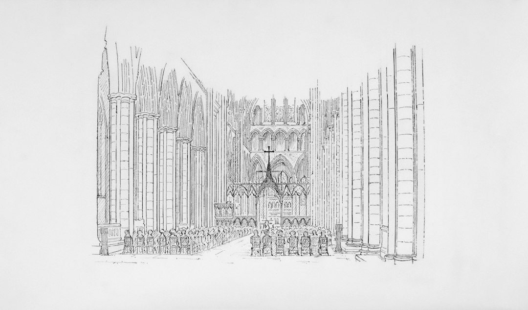
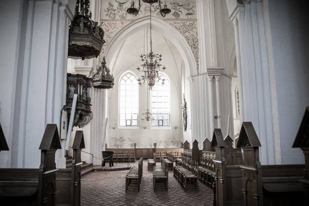
Haderslev Cathedral rises from a modest square in the historic centre, yet its interior quickly changes the scale of experience. Outside, the town feels measured and human, framed by streets, façades, and the deep russet tones of medieval red brick (munkesten). Inside, the visitor enters an ethereal, light-filled world: the eye is drawn upward through soaring whitewashed surfaces, slender fluted piers, pointed arches, and a choir that reaches approximately 22 metres into the air. The transition is not merely from exterior to interior, but from civic red brick into a luminous sacred verticality.
Light gives the building its most enchanting character. Filtered through tall traceried windows, daylight washes across pristine white plaster and vaulted ceilings as the hours pass, constantly shifting in intensity and angle. The effect is especially striking in the choir, where the massive masonry seems to shed its physical weight. Haderslev’s achievement rests on a compelling architectural dialogue: medieval master builders used sturdy fired clay on the exterior to construct a daring High Gothic framework, while the interior was finished in luminous whitewash that captures and multiplies the northern light. The cathedral demonstrates that Gothic monumentality did not depend exclusively on imported limestone or pale freestone to create an uplifting, brilliant interior.
From Romanesque Granite to Soaring Brick Gothic
The story begins with a much more restrained building. The earliest known church on the site was a Romanesque ashlar structure dating from around 1150, probably ending in an apse. Its granite masonry belonged to an architectural language of solidity: thick walls, carefully laid stone, and a visual emphasis on permanence rather than height. Such churches were not without ambition, but their forms generally expressed mass and enclosure more strongly than the later Gothic ideal of upward movement.
A fire in 1247 became a decisive turning point. Reconstruction introduced brick, a material particularly suited to the resources and building traditions of the Baltic region. The first post-fire scheme was intended as a cross church, but around 1270 the plan changed into a three-aisled hall church (hallekirke) with vaults of equal height, making it Denmark’s earliest hall church. This was an important architectural milestone. Rather than reserving a dominant vertical axis for a raised central nave, the hall arrangement created a unified interior in which the aisles and nave shared a continuous spatial volume.
The most dramatic transformation came between approximately 1420 and 1440. Growing liturgical ambitions and the demand for side chapels prompted a comprehensive rebuilding that radically altered the church’s typology. Master builders erected an immense high choir reaching 22 metres and raised the central nave far above the side aisles, transforming the hall church into a monumental Gothic stepped basilica with clerestory windows, complemented by a western tower with a saddle roof. The result was no longer simply an expanded parish church; it became one of the most prominent Gothic basilicas in the Nordic realm, its vertical profile reshaping the skyline of the region. Later damage, including a catastrophic fire in 1627 during the Thirty Years’ War, collapsed the western bays and destroyed much of the medieval furnishings, leading to a shorter nave reconstruction. Even so, the soaring majesty of the 15th-century choir survived intact.
- The Romanesque church established the first stone-built foundation around the mid-12th century.
- The 1247 fire encouraged a new architectural direction executed in red Baltic monk brick.
- The revised late-13th-century plan introduced Denmark’s earliest three-aisled hall church.
- The 1420 to 1440 rebuilding transformed the hall church into a stepped Gothic basilica with a 22-metre-high choir and clerestory lighting.
For a fuller account of the building’s successive campaigns, fires, and restorations, the architectural record in Haderslev Domkirke on Lex provides valuable historical context. The church’s later status also reflects regional history. Following Southern Jutland’s reunification with Denmark in 1920, Vor Frue Kirke became the cathedral of Haderslev Diocese in 1922, giving the medieval building a renewed institutional and liturgical role.
The Engineering Feat of High Gothic Brickwork
Stone Gothic architecture is often associated with the great limestone and sandstone churches of France, England, and the German lands. In those settings, blocks of freestone could be cut into elaborate profiles for arches, capitals, ribs, and window tracery. Northern brick Gothic had to solve similar structural and visual problems with a very different medium. The Baltic brick known as munkesten, or monk brick, was shaped and fired rather than quarried and dressed. On the exterior, its surfaces display the rugged craftsmanship and modular discipline of fired clay.
Brick does not make Gothic construction simple. A 22-metre vault generates enormous outward thrust, and tall walls must manage the immense forces created by high-pitched roofs and wind loads. Haderslev solved this engineering challenge through a feature unique in Danish architectural history. While standard regional brick churches relied entirely on internal piers or thickened wall buttresses, Haderslev’s master builders constructed Denmark’s only surviving medieval exterior flying buttress system (stræbebuer). Four external flying buttresses span outward from the high choir, transferring the lateral thrust of the high vaults across the lower chapels and directly down to the foundation.
This external skeleton allowed the builders to dissolve the choir walls into towering ribbons of glass, flooding the interior with light. Inside, the structural forces are collected by slender, fluted piers and pointed ribbed vaults. Comprehensive whitewashing (hvidkalkning) of the interior-carried out during major restorations in 1844-1845 and 1941-1951-covers the structural brickwork with smooth white plaster. The structural reality is thus experienced as an interplay between powerful red-brick engineering on the outside and pure, luminous geometry within. Comparative architectural surveys, including the overview of Haderslev Cathedral’s Gothic architecture, help place this regional masterpiece within the wider European development of High Gothic engineering.
| Feature | Stone Gothic comparison | Haderslev’s brick vernacular |
|---|---|---|
| Primary material | Quarried limestone or freestone, often pale and finely carved | Fired Baltic monk brick (munkesten) on exterior; interior fully finished in reflective white plaster and whitewash |
| Structural expression | External flying buttresses and deeply carved skeletal members | Denmark’s sole surviving medieval exterior flying buttresses (stræbebuer) supporting the high choir walls |
| Surface character | Continuous dressed stone, capable of intricate sculptural detail | Warm, textured red-brick masonry externally, contrasted with completely whitewashed surfaces and piers internally |
| Spatial effect | Lightness achieved through skeletal articulation and expansive glazing | Lightness achieved through vertical basilica proportions, 15.9-metre lancets, and bright whitewashed vaults that diffuse light |
What stands out is not that brick imitates stone, but that it produces its own distinct expression of grandeur. The exterior red-brick masonry grounds the building in the tangible traditions of Baltic craftsmanship, while the interior whitewash transforms the voluminous choir into a radiant sanctuary. The white plaster does not hide the architecture; it articulates every rib, vaulting intersection, and pier flute, allowing the enormous height to produce a sensation of weightless grace.
How Tall Lancets Sculpt Space and Sound
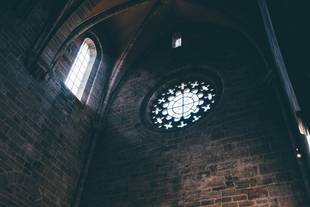
The choir’s windows are among its most powerful instruments of perception. The tallest traceried openings rise to approximately 15.9 metres, turning the eastern walls into towering directional lanterns. Their vertical emphasis does not simply admit light; it pulls the gaze upward, dividing daylight into majestic vertical bands that correspond with the architecture’s own ascent. As daylight enters the choir, it reflects off the white plaster surfaces, bathing the high altar and surrounding stalls in a clear, serene brilliance that shifts in tone from the cool brightness of morning to the golden warmth of late afternoon.
These openings also shape the acoustic impression of the choir. The soaring height, broad expanses of window glass, and smooth plaster vaults create an acoustic environment of remarkable resonance and sustain. High frequencies resonate cleanly against the plastered masonry, while the sheer 22-metre volume allows sound to bloom. Choral singing, organ voluntaries, and spoken liturgy linger beneath the vaults, creating a reverberant acoustic envelope where musical lines remain distinct while acquiring a rich, cathedral-scale depth.
- In the morning, look for the sharp contrast between luminous window bays and the soft shadows curving under the high vaults.
- Around midday, observe how natural light reflects evenly off the white walls, illuminating the fluting of the piers and the geometry of the ribs.
- Later in the day, watch for raking light that casts elongated silhouettes across the whitewashed tracery and mouldings.
- During music, listen for the majestic decay time as sung phrases resonate within the 22-metre-high choir vaulting.
The cathedral remains an active house of worship rather than a museum, so the most attentive visit combines visual curiosity with respect for services and scheduled events. Its official visitor information notes that sightseeing and personal reflection are welcome, while guided tours may be arranged through the vergers during opening hours. Access can be restricted during services, weddings, funerals, and concerts, making it sensible to check current arrangements before travelling.
Observing the Choir Through a Curator Eyes
- Begin at the crossing. Stand where the lower nave meets the towering east end and allow the dramatic vertical step toward the 22-metre choir to register. From this vantage point, the building reads clearly as a stepped basilica rather than a uniform hall, emphasizing the daring height of the 15th-century rebuilding.
- Follow the architecture upward. Trace the clean vertical lines of the fluted piers as they rise continuously from the floor into the springers and ribs of the vaulted ceiling. The whitewashed finish highlights the geometric precision of each arch and rib against the white plaster webs.
- Read the windows as composition. Notice how the 15.9-metre lancets frame the choir, turning the apse into a lantern of glass. The slender tracery breaks the northern sky into vertical rhythms that echo the piers themselves.
- Listen beneath the vaults. Pause quietly beneath the choir ceiling and attend to the way footsteps, voices, or organ notes occupy the air. The acoustic resonance makes the invisible volume of the building immediately tangible.
Look also at the relationship between medieval architecture and contemporary liturgical artistry. The cathedral houses exceptional liturgical textiles designed by Queen Margrethe II of Denmark. Four exquisite chasubles-crafted across the canonical colours of white, green, purple, and red-along with the bishop’s cope created in 2000, are preserved and displayed in custom glass vitrines beneath the choir. Meanwhile, their four matching antependiums serve their active ceremonial purpose directly on the high altar, rotated throughout the year to mark the unfolding liturgical seasons.
The memorial chapel for the Schleswig Foot Regiment (Slesvigske Fodregiment), which carries deep ties to the historic garrison town of Haderslev, and the cathedral’s continuing role as a diocesan seat add further historical dimensions to the visit. Architecture here is not isolated from memory, civic duty, or living worship. It is an enduring framework that gathers community, where medieval engineering and modern devotion continue to share the same luminous space.
Carry the Lessons of Sacred Space into Your Next Exploration
Haderslev Cathedral makes a strong case for looking beyond stone monuments when studying European Gothic architecture. Its builders took Baltic clay, fire, lime mortar, and a demanding structural program, fashioning a building of extraordinary height and enduring grace. The achievement lies in balancing robust external brickwork-reinforced by Denmark’s only medieval flying buttresses-with a luminous, whitewashed interior that captures every nuance of northern daylight.
For travellers, the most rewarding approach is unhurried. Visit during daytime opening hours when the light streaming through the 15.9-metre choir lancets is at its most expressive, taking care to verify service schedules beforehand. Allow time to stand at the crossing, step outside to inspect the exterior flying buttresses bracing the high choir, and return inside to sit beneath the 22-metre vaults. Haderslev’s lesson extends well beyond Southern Jutland: architectural wonder does not depend on rare imported stone. With vision and technical mastery, builders could turn humble earth into a sanctuary of soaring light.