
Slipware and Vernacular Glazes Across Five Centuries at Ehlers Samlingen

Clay and Domestic Life Across Five Centuries

In Haderslev, a 1577 half-timbered merchant house gives domestic pottery an unusually vivid setting. The building at Slotsgade 20 houses Ehlers Samlingen, described as Northern Europe”s largest pottery collection, with objects spanning approximately five centuries. Its wooden beams, Renaissance panel paintings, and painted ceilings create a compelling contrast with the vessels on display. Earthenware that once stood beside a hearth, pantry shelf, or kitchen table can be viewed here as both historical evidence and carefully made design.

The collection invites a change in scale. A storage jar may appear modest, yet its rounded body, irregular glaze, and hand-drawn ornament record choices about materials, labor, taste, and use. Across Scandinavia, humble red earthenware transformed functional necessity into visual expression. Pots held food, carried liquids, marked celebrations, and supported communal rituals, while their surfaces gave makers room for rhythm, humor, color, and gesture. At Ehlers Samlingen, the lineage leads from utilitarian household vessels toward the freer, more expressive language of early modernism.

Antique slipware dish with a painted child and blue scalloped rim
Across five centuries, humble vessels turned everyday acts of storing, serving, and sharing into records of regional taste and communal life.

The Chemistry of Regional Lead Glazes and Slip Trailing

Look closely at Scandinavian red earthenware and the surface often seems to hold its own light. That effect came from a combination of porous, iron-rich clay and a low-fired lead glaze. The body could burn to shades of red, orange, or warm brown, while the glaze softened the surface into transparent amber, yellow, green, or brown. Because lead compounds melt at relatively low temperatures, they were practical for traditional earthenware kilns. They also produced a glossy coating that made vessels easier to clean and gave decoration a striking visual depth.

Traditional glaze recipes were not standardized industrial formulas. They depended on local clay, available minerals, ash, sand, and the experience of individual workshops. A potter adjusted the mixture according to the character of the clay body, the thickness of application, and the heat of the firing. Small changes could produce dramatic results: a thin coating might reveal the color and texture beneath, while a heavier application could pool in incised lines and recesses. The chemistry therefore became visible as atmosphere, variation, and surface tension.

One of the most distinctive decorative processes was slip trailing, known in Danish as hornglasering. A liquid mixture of finely prepared clay, or slip, was placed in an animal horn fitted with a narrow opening. The potter squeezed and guided the horn across the damp vessel, drawing lines, dots, loops, leaves, and flowing bands. Unlike painted decoration, slip trailing has physical volume. The raised line catches the glaze differently from the surrounding clay, so the design becomes legible through both color and relief.

  • Clay body: the fired earthenware beneath the decoration and glaze, often marked by local mineral content.
  • Slip: liquid clay used to build up contrasting lines or broader areas of ornament.
  • Lead glaze: a low-temperature glassy coating that intensifies color and protects the porous body.
  • Firing: the controlled heating process that determines hardness, color, gloss, and the final relationship between body and glaze.

Modern scientific examination helps conservation specialists and archaeologists understand the precise material properties, chemical stability, and durability of historic glazes. Beyond visual inspection, chemical analysis and micro-stratigraphy clarify how raw materials were compounded, fired, and altered through daily domestic use. For instance, an archaeometric study on Renaissance lead-glazed ceramics from southern Denmark investigated the release of lead and the susceptibility of regional wares to acid etching, offering valuable insight into how glaze recipes responded to the storage of acidic foodstuffs. Such scientific research demonstrates how workshop compounding, kiln conditions, and functional demands shaped the material history of historical earthenware in ways that remain invisible to the naked eye in a display case.

The wider history of lead-glazed pottery is also more interconnected than a simple story of imported influence. Research on medieval Danish pottery compares fabric, form, glaze, decoration, archaeological context, and distribution across Denmark, England, Sweden, the Netherlands, Belgium, and France. Some vessels appear to reflect English or French connections, while others point toward the Low Countries or local South Scandinavian production. Among the most revealing objects are anthropomorphically decorated jugs, whose faces and moulded features show that Danish workshops were not merely copying foreign examples. They were adapting circulating ideas into distinct regional forms.

Ritual in the Kitchen with Barselspotter and Maternity Vessels

Some of the most moving objects in a pottery collection are those tied to a precise human occasion. The barselspotte, or maternity pot, belonged to a Nordic tradition in which a vessel carrying nourishing food was brought to a woman who had recently given birth. The pot was therefore more than a container. It was part of a social practice that connected households, neighbors, relatives, and village life through an act of care.

The customary food was often a restorative groat soup, a substantial dish suited to recovery after childbirth. Its movement from one kitchen to another gave the pot a ceremonial role. The vessel had to carry food safely, but its appearance could also communicate generosity and belonging. A decorated pot placed before a new mother made domestic skill visible, turning nourishment into a shared public gesture while keeping the center of attention within the household.

Historic Danish records preserve this custom as part of folk culture, and the national encyclopedia entry on the barselspotte helps place the vessel within its wider social setting. The object”s significance lies precisely in the meeting of practical and symbolic functions. It held soup, yet it also carried expectations about hospitality, female networks, celebration, and the responsibilities surrounding birth.

Feature Practical role Visual or social significance
Rounded body Held a generous quantity of soup or porridge Suggested abundance, warmth, and domestic care
Glazed interior Reduced absorption and made cleaning easier Displayed the workshop”s control of color and finish
Loop or sturdy handle Supported carrying between households Reinforced the vessel”s role in communal exchange
Slip decoration Added a raised, durable surface design Gave an everyday object personal and regional character

Comparing maternity vessels across regions and centuries reveals how much local identity could be expressed within a shared form. One workshop might favor broad bands and restrained dots, while another used scrolling foliage, energetic trailing, or contrasting glaze pools. Differences in clay color, rim shape, handle construction, and decoration may reflect changing fashions, available materials, and the hands of particular makers. The vessels should not be treated as anonymous examples of folk craft. Their variations are evidence of active decision-making.

At Ehlers Samlingen, kitchenware gains historical force because it is shown alongside the broader development of pottery. Soup pots, plates for fish dishes, storage vessels, and decorated jugs establish a material map of everyday life. The viewer can ask practical questions first: how was the object lifted, filled, poured, or washed? Then the surface opens a second line of inquiry. Why does a maker emphasize a particular band or motif? What does the glaze conceal, and what does it reveal? Such looking restores the intelligence embedded in domestic objects.

Thorvald Bindesboll and the Modernist Transformation of Slipware

Thorvald Bindesbøll”s ceramics demonstrate what happens when vernacular methods are treated as a source of invention rather than as a fixed historical style. Trained as an architect at the Royal Danish Academy of Fine Arts and graduating in 1876, Bindesbøll turned increasingly toward ceramics after finding limited opportunities in architecture. He began working at Frauens Lervarefabrik in 1880, experimented at Johan Wallmann”s pottery from 1883, and joined G. Eifrig at Københavns Lervarefabrik in 1891.

His 1893 glazed earthenware dish, now in The David Collection, belongs to an especially important period. The form is circular and disciplined, yet the decoration refuses quiet symmetry. Deep clay incisions, a rough craquelured surface, a grooved framing band, and a curved multi-armed pattern create a surface full of movement. The dish does not simply display an image. It makes the act of decoration physically apparent, as though the maker”s hand has set rhythm into the clay.

Bindesbøll”s method depended on collaboration. Professional potters formed jars and dishes according to his designs, while he worked directly on the wet clay with tools and fingers, carving, scratching, and applying glazes. He used a restricted palette, but the limited colors intensified the relationship between line, texture, and relief. Slip could be poured or guided across the surface, allowing decoration to spread with a sense of controlled accident. What stands out is not a polished imitation of historical pottery, but a deliberate embrace of material irregularity.

  • Carving: deep cuts exposed the clay body and created shadows beneath the glaze.
  • Scratching: finer marks gave the surface a drawn, almost graphic energy.
  • Slip pouring and trailing: liquid clay produced raised paths that could curve, branch, or pool.
  • Restricted glazing: coordinated colors allowed texture and movement to remain visually dominant.

The connection to earlier Scandinavian pottery is especially clear in the balance between utility and expressive surface. Bindesbøll favored jars and circular dishes, familiar forms that could enter domestic life without becoming conventional. His innovation lay in making their surfaces active. The vessel became a site of gesture, where organic and arabesque forms could replace literal imagery and where the irregularities of handwork became signs of artistic presence.

This transformation helped establish a foundation for modern Danish ceramic design. Bindesbøll initially drew on Far Eastern sources, but developed a personal non-figurative language that resisted strict historical classification. His work was shown at the 1900 Paris Exposition Universelle, alongside his silver designs, and later art historians recognized his unusual originality. The significance of his ceramics is not that they abandoned tradition. Rather, they showed how regional craft knowledge could be reactivated through abstraction, collaboration, and a willingness to let the material lead.

Carrying Forward the Quiet Brilliance of Nordic Earthenware

Ehlers Samlingen preserves more than a sequence of styles. Within the wooden beams of the Haderslev house, pottery becomes a record of relationships: between clay and fire, maker and user, household and community, local practice and international exchange. A lead-glazed jug can reveal trade connections; a maternity pot can evoke collective care; a Bindesbøll dish can show how the gestures of vernacular decoration entered modern art.

For visitors and ceramic enthusiasts, the most rewarding approach is to look slowly. Notice where glaze gathers, where a trailing line changes thickness, where a rim has been handled repeatedly, or where a supposedly regular form quietly departs from symmetry. Everyday pottery deserves that attention because its beauty is inseparable from use. The enduring lesson of Ehlers Samlingen is that modern design did not emerge from nowhere. Its freedom, texture, and human scale were already present in the quiet brilliance of Nordic earthenware.

Sacred Threads: Queen Margrethe II’s Modern Vestments in Haderslev Cathedral

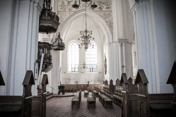
Entering the Luminous Vault of Haderslev Domkirke

Inside Haderslev Cathedral, southern Jutland light moves across brick Gothic walls, pale stone, timber, and painted surfaces with a quiet northern clarity. The building, known locally as Haderslev Domkirke or Vor Frue Kirke, is not simply a container for worship. Its architecture creates a changing field of shadow and radiance in which every textile, metal fitting, and embroidered line acquires unusual visual force. Deeply embedded in this historic sanctuary, as described by the authoritative architectural account, the liturgical garments challenge conventional medieval motifs through a distinctly modern sensitivity to material and place.

Queen Margrethe II enters this setting not merely as a monarch, but as a designer, embroiderer, and attentive interpreter of sacred space. Her church textiles respect the inherited grammar of Lutheran worship while loosening its visual vocabulary. Instead of relying only on heraldic devices, formal crosses, or standardized historical ornament, they make room for the intimate language of leaves, petals, vines, and hand-worked surfaces. In Haderslev, that approach gives traditional liturgy a tactile regional identity. The vestments do not compete with the cathedral; they animate it, allowing Danish nature and devotional meaning to meet beneath the changing southern Jutland light.

A Royal Thread Through Sacred History

Queen Margrethe”s involvement with ecclesiastical textiles began in the mid-1970s and developed into one of the most sustained artistic practices associated with the Danish royal household. Her first major church textile project was a green chasuble for Fredensborg Palace Church. Together with white and violet chasubles, it was presented for the church”s 250th anniversary in 1976. Queen Ingrid and Princess Benedikte contributed to the needlework on the accompanying pieces, establishing from the outset that these works were collaborative objects, shaped by design, sewing, appliqué, and patient assembly.

The Queen”s later commissions extended across Denmark, Greenland, Germany, and England. They include episcopal capes, robes, chasubles in the principal liturgical colors, antependiums, altar cloths, a wedding rug, and a cover for a hymnbook. The Danish Royal House notes that she designed all of these works, while the practical embroidery and construction were sometimes undertaken with the assistance of Selskabet for Kirkelig Kunst. This distinction is important. The authority of the finished textile lies not only in its royal authorship, but also in the specialized craft required to translate a drawing or concept into a durable object suitable for worship.

Haderslev”s own ecclesiastical history gives the 2000 commission particular weight. Haderslev Stift was established in 1922, but its bishops initially relied on Brorson”s historic episcopal cope, loaned by Ribe Stift. That arrangement connected the new diocese to an older regional heritage, yet it also meant that Haderslev lacked a vestment designed specifically for its own institutional and architectural identity. Queen Margrethe”s purpose-made cope, designed for the diocese and first used at a cathedral service in October 2000, supplied that missing visual statement; the ceremonial character of such royal textiles is also evoked by Første gudstjeneste for Dronning Margrethes messehagel.

  • The diocese was established in 1922.
  • Its bishops initially used an older cope associated with Brorson, borrowed from Ribe Stift.
  • The new episcopal cope was designed by Queen Margrethe and introduced in 2000.
  • The older borrowed cope was returned to Ribe Stift in 2010.

The Anatomy of the 2000 Haderslev Episcopal Cope

Look first at the cope”s material presence. Its exterior is made from white silk and cotton, a combination that produces both crispness and softness. The pale surface reflects the cathedral”s available light rather than absorbing it, allowing the garment to sit in visual conversation with the building”s brick and stone. Its specially dyed orange lining introduces a warm interior glow, a color encountered most dramatically when the cope moves, opens, or turns during a service. The garment also includes an attached stole and clipeus, while a patchwork decoration structures the back.

The most concentrated visual statement appears in the large clasp inspired by the Luther rose. Crafted by goldsmith Bent Gabrielsen, it measures slightly more than 13 centimeters across. A white-gold cross rests on a red-gold heart, encircled by five rust-colored quartz stones set within a gold ring. The contrast between the restraint of the white ground and the jewel-like intensity of the fastening gives the cope a carefully controlled visual rhythm. Queen Margrethe carried out the sewing with embroiderers Marianne Engell and Susanne Rubebo. The result is neither a medieval revival nor a purely secular design object. It is a contemporary episcopal garment that retains recognizable Christian symbolism while translating it into Scandinavian clarity.

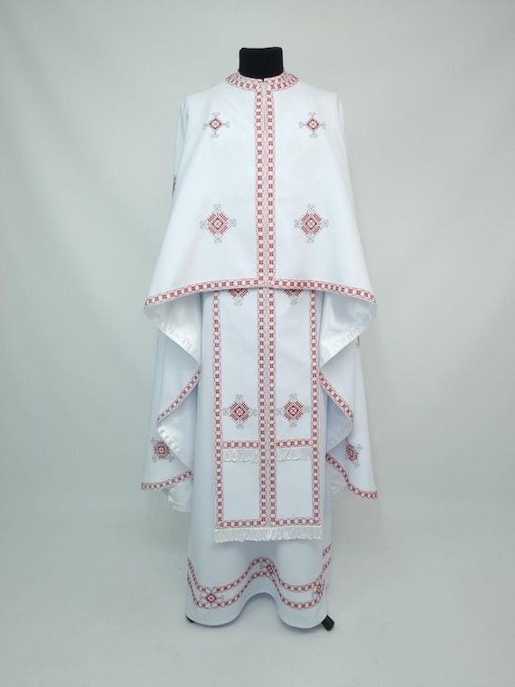
White embroidered liturgical vestment with red geometric trim on a mannequin
In contemporary church textiles, color, structure, and handwork transform inherited symbols into a visual language suited to both communal worship and a modern regional identity.
Feature Visual effect Interpretive significance
White silk-and-cotton exterior Reflects light and creates a calm field Connects the cope to white”s traditional association with major feasts
Orange lining Introduces warmth during movement Gives the garment an intimate interior dimension
Patchwork back decoration Breaks up the large surface through constructed rhythm Emphasizes handcraft and assembly rather than anonymous luxury
Luther rose inspired clasp Concentrates symbolic and material weight at the fastening Links Lutheran identity with contemporary metalwork
Rust-colored quartz stones Provides restrained flashes of earthy color Bridges precious ornament and the palette of southern Jutland

Wild Flora and Living Theology Under the Needle

What distinguishes Queen Margrethe”s ecclesiastical work is not the abandonment of tradition, but its redirection. Conventional Latin iconography often communicates through established signs: the cross, the monogram, the crown, the lamb, or the saint”s attribute. Her textiles can include such references, yet they also allow botanical forms to carry devotional atmosphere. A flowering stem does not need to function as a coded emblem to become meaningful. It may suggest growth, dependence, renewal, and the continuing presence of Creation within worship.

In this visual theology, petals and green vines make belief feel close to the ground. Their forms recall meadow plants, garden borders, and the changing vegetation of the Danish landscape. The effect is especially compelling on a garment, because the imagery moves with the wearer. A static image becomes a living field, expanding and contracting as the bishop walks, turns, raises an arm, or stands before the altar. Stitching gives the flora a physical rhythm: a line can be slightly uneven, a surface can catch light differently from one angle to the next, and a dense passage of thread can make a leaf appear almost raised from the cloth.

This regional attentiveness is also visible in the Queen”s work for Gråsten Palace Church (which closed to the public in January 2025 for a comprehensive interior restoration extending through spring 2028). When a new chasuble was consecrated there in July 2019, the garment”s connection to the surrounding landscape was made explicit. Queen Margrethe embroidered the chasuble herself, drawing inspiration from the natural environment around Gråsten Palace. The textile complements an antependium presented the previous year and includes lines from hymns such as “Som tørstig hjort,” “Alle mine kilder,” and “I al sin glans.” Its petitpoint embroidery, formed through diagonal half-cross stitches, demonstrates how text and landscape can be joined through laborious, pixel-like accumulation. The regional sensibility documented in the official Danish Royal House account of the dedication service helps clarify the broader principle at work in Haderslev: local nature is not an ornamental afterthought, but a route into reflection.

  • Observe whether plant forms are naturalistic, stylized, or abstracted.
  • Notice how green suggests living growth rather than merely filling empty space.
  • Look for the relationship between embroidered text and surrounding imagery.
  • Consider how movement changes the perceived rhythm of the design.

Appreciating Ecclesiastical Art with a Curatorial Eye

Church textiles are often encountered under imperfect viewing conditions. They may be seen from a distance, during a service, or only briefly as the clergy move through the chancel. That limitation can sharpen attention. Begin with the silhouette rather than the detail. Ask how the cope or chasuble changes the scale of the person wearing it, how its color sits against the altar, and whether the garment appears to advance toward the congregation or recede into the architecture.

Liturgical color is a practical guide to visual weight. Green is associated with Trinity time, violet with Advent and Lent, white with Christmas, Easter through Pentecost, and other feasts, while red is used at Pentecost and on St. Stephen”s Day. These colors do more than identify a season. They alter the balance of the entire sanctuary. A white cope can gather and scatter light; red can create a concentrated field of intensity; violet can deepen the atmosphere; green can settle the eye into a quieter, continuous rhythm.

  1. Start with distance. View the vestment as a whole and note its outline, dominant color, and relationship to the architecture.
  2. Move closer when possible. Look for appliqué edges, changes in stitch direction, overlaps, and areas where the fabric has been deliberately left calm.
  3. Follow the light. Metallic thread and polished fittings may flare briefly in candlelight, while matte wool or dense silk absorbs illumination.
  4. Read the surface as labor. Stitch density, tiny irregularities, and layered construction reveal how time and handwork shaped the object.
  5. Separate observation from interpretation. First describe what is visible, then consider how color, flora, text, and symbolism may function within worship.

The most rewarding details often appear at the boundary between materials. A metallic thread can sharpen the edge of a leaf, while a softer silk thread gives the interior a muted, almost painted tone. Appliqué layering creates small changes in relief, and petitpoint produces a granular surface that becomes legible only at close range. Candlelight is particularly revealing because it does not illuminate evenly. It travels across raised stitches, pauses on gold, and disappears into dark folds. In that shifting light, the vestment becomes less like a flat picture and more like a responsive architectural surface.

Encountering Living Devotion in Modern Needlework

Queen Margrethe II”s church textiles demonstrate how contemporary design can renew inherited ritual without severing its historical roots. In the Haderslev episcopal cope, white silk, orange lining, patchwork, quartz, gold, and the Luther rose form a visual identity for a diocese that once depended on a borrowed historic garment. In the wider body of her work, botanical motifs, hymn texts, and regional references bring worship into contact with the Danish landscape. The meaning is carried not only by symbols, but by texture, weight, movement, and the visible patience of the hand.

That achievement is likely to receive broader public attention through “Thread of Faith: HM Queen Margrethe”s Church Textiles,” an exhibition announced for Koldinghus from 4 June to 28 November 2027. The planned presentation of approximately 30 works should make it possible to compare chasubles, episcopal garments, and embroideries across several decades and locations. Until then, visitors encountering southern Denmark”s cathedrals can practice the same attentive looking: pause before the color, follow the line of a vine, notice where light settles, and allow the fabric to reveal devotion as something made, handled, worn, and continually brought to life.

Light and Clay: Reading the Soaring Red Brick Choir of Haderslev Domkirke

Step Inside the Cathedral of Soaring White Vaults and Northern Light

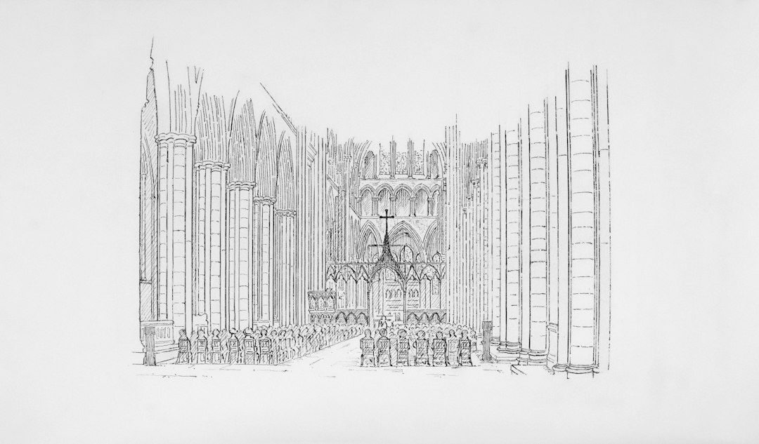
Haderslev Cathedral rises from a modest square in the historic centre, yet its interior quickly changes the scale of experience. Outside, the town feels measured and human, framed by streets, façades, and the deep russet tones of medieval red brick (munkesten). Inside, the visitor enters an ethereal, light-filled world: the eye is drawn upward through soaring whitewashed surfaces, slender fluted piers, pointed arches, and a choir that reaches approximately 22 metres into the air. The transition is not merely from exterior to interior, but from civic red brick into a luminous sacred verticality.

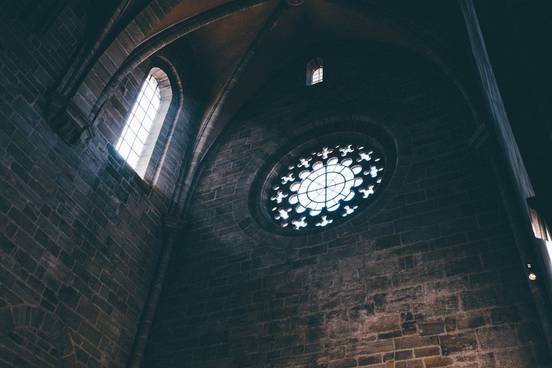
Light gives the building its most enchanting character. Filtered through tall traceried windows, daylight washes across pristine white plaster and vaulted ceilings as the hours pass, constantly shifting in intensity and angle. The effect is especially striking in the choir, where the massive masonry seems to shed its physical weight. Haderslev’s achievement rests on a compelling architectural dialogue: medieval master builders used sturdy fired clay on the exterior to construct a daring High Gothic framework, while the interior was finished in luminous whitewash that captures and multiplies the northern light. The cathedral demonstrates that Gothic monumentality did not depend exclusively on imported limestone or pale freestone to create an uplifting, brilliant interior.

Dark brick Gothic interior with vaulted arches and rose window
The cathedral”s whitewashed interior turns structural height into a luminous expression of northern Gothic, showing how light can define sacred space as powerfully as masonry.

From Romanesque Granite to Soaring Brick Gothic

The story begins with a much more restrained building. The earliest known church on the site was a Romanesque ashlar structure dating from around 1150, probably ending in an apse. Its granite masonry belonged to an architectural language of solidity: thick walls, carefully laid stone, and a visual emphasis on permanence rather than height. Such churches were not without ambition, but their forms generally expressed mass and enclosure more strongly than the later Gothic ideal of upward movement.

A fire in 1247 became a decisive turning point. Reconstruction introduced brick, a material particularly suited to the resources and building traditions of the Baltic region. The first post-fire scheme was intended as a cross church, but around 1270 the plan changed into a three-aisled hall church (hallekirke) with vaults of equal height, making it Denmark’s earliest hall church. This was an important architectural milestone. Rather than reserving a dominant vertical axis for a raised central nave, the hall arrangement created a unified interior in which the aisles and nave shared a continuous spatial volume.

The most dramatic transformation came between approximately 1420 and 1440. Growing liturgical ambitions and the demand for side chapels prompted a comprehensive rebuilding that radically altered the church’s typology. Master builders erected an immense high choir reaching 22 metres and raised the central nave far above the side aisles, transforming the hall church into a monumental Gothic stepped basilica with clerestory windows, complemented by a western tower with a saddle roof. The result was no longer simply an expanded parish church; it became one of the most prominent Gothic basilicas in the Nordic realm, its vertical profile reshaping the skyline of the region. Later damage, including a catastrophic fire in 1627 during the Thirty Years’ War, collapsed the western bays and destroyed much of the medieval furnishings, leading to a shorter nave reconstruction. Even so, the soaring majesty of the 15th-century choir survived intact.

  • The Romanesque church established the first stone-built foundation around the mid-12th century.
  • The 1247 fire encouraged a new architectural direction executed in red Baltic monk brick.
  • The revised late-13th-century plan introduced Denmark’s earliest three-aisled hall church.
  • The 1420 to 1440 rebuilding transformed the hall church into a stepped Gothic basilica with a 22-metre-high choir and clerestory lighting.

For a fuller account of the building’s successive campaigns, fires, and restorations, the architectural record in Haderslev Domkirke on Lex provides valuable historical context. The church’s later status also reflects regional history. Following Southern Jutland’s reunification with Denmark in 1920, Vor Frue Kirke became the cathedral of Haderslev Diocese in 1922, giving the medieval building a renewed institutional and liturgical role.

The Engineering Feat of High Gothic Brickwork

Stone Gothic architecture is often associated with the great limestone and sandstone churches of France, England, and the German lands. In those settings, blocks of freestone could be cut into elaborate profiles for arches, capitals, ribs, and window tracery. Northern brick Gothic had to solve similar structural and visual problems with a very different medium. The Baltic brick known as munkesten, or monk brick, was shaped and fired rather than quarried and dressed. On the exterior, its surfaces display the rugged craftsmanship and modular discipline of fired clay.

Brick does not make Gothic construction simple. A 22-metre vault generates enormous outward thrust, and tall walls must manage the immense forces created by high-pitched roofs and wind loads. Haderslev solved this engineering challenge through a feature unique in Danish architectural history. While standard regional brick churches relied entirely on internal piers or thickened wall buttresses, Haderslev’s master builders constructed Denmark’s only surviving medieval exterior flying buttress system (stræbebuer). Four external flying buttresses span outward from the high choir, transferring the lateral thrust of the high vaults across the lower chapels and directly down to the foundation.

This external skeleton allowed the builders to dissolve the choir walls into towering ribbons of glass, flooding the interior with light. Inside, the structural forces are collected by slender, fluted piers and pointed ribbed vaults. Comprehensive whitewashing (hvidkalkning) of the interior-carried out during major restorations in 1844-1845 and 1941-1951-covers the structural brickwork with smooth white plaster. The structural reality is thus experienced as an interplay between powerful red-brick engineering on the outside and pure, luminous geometry within. Comparative architectural surveys, including the overview of Haderslev Cathedral’s Gothic architecture, help place this regional masterpiece within the wider European development of High Gothic engineering.

Feature Stone Gothic comparison Haderslev’s brick vernacular
Primary material Quarried limestone or freestone, often pale and finely carved Fired Baltic monk brick (munkesten) on exterior; interior fully finished in reflective white plaster and whitewash
Structural expression External flying buttresses and deeply carved skeletal members Denmark’s sole surviving medieval exterior flying buttresses (stræbebuer) supporting the high choir walls
Surface character Continuous dressed stone, capable of intricate sculptural detail Warm, textured red-brick masonry externally, contrasted with completely whitewashed surfaces and piers internally
Spatial effect Lightness achieved through skeletal articulation and expansive glazing Lightness achieved through vertical basilica proportions, 15.9-metre lancets, and bright whitewashed vaults that diffuse light

What stands out is not that brick imitates stone, but that it produces its own distinct expression of grandeur. The exterior red-brick masonry grounds the building in the tangible traditions of Baltic craftsmanship, while the interior whitewash transforms the voluminous choir into a radiant sanctuary. The white plaster does not hide the architecture; it articulates every rib, vaulting intersection, and pier flute, allowing the enormous height to produce a sensation of weightless grace.

How Tall Lancets Sculpt Space and Sound

The choir’s windows are among its most powerful instruments of perception. The tallest traceried openings rise to approximately 15.9 metres, turning the eastern walls into towering directional lanterns. Their vertical emphasis does not simply admit light; it pulls the gaze upward, dividing daylight into majestic vertical bands that correspond with the architecture’s own ascent. As daylight enters the choir, it reflects off the white plaster surfaces, bathing the high altar and surrounding stalls in a clear, serene brilliance that shifts in tone from the cool brightness of morning to the golden warmth of late afternoon.

These openings also shape the acoustic impression of the choir. The soaring height, broad expanses of window glass, and smooth plaster vaults create an acoustic environment of remarkable resonance and sustain. High frequencies resonate cleanly against the plastered masonry, while the sheer 22-metre volume allows sound to bloom. Choral singing, organ voluntaries, and spoken liturgy linger beneath the vaults, creating a reverberant acoustic envelope where musical lines remain distinct while acquiring a rich, cathedral-scale depth.

  • In the morning, look for the sharp contrast between luminous window bays and the soft shadows curving under the high vaults.
  • Around midday, observe how natural light reflects evenly off the white walls, illuminating the fluting of the piers and the geometry of the ribs.
  • Later in the day, watch for raking light that casts elongated silhouettes across the whitewashed tracery and mouldings.
  • During music, listen for the majestic decay time as sung phrases resonate within the 22-metre-high choir vaulting.

The cathedral remains an active house of worship rather than a museum, so the most attentive visit combines visual curiosity with respect for services and scheduled events. Its official visitor information notes that sightseeing and personal reflection are welcome, while guided tours may be arranged through the vergers during opening hours. Access can be restricted during services, weddings, funerals, and concerts, making it sensible to check current arrangements before travelling.

Observing the Choir Through a Curator Eyes

  1. Begin at the crossing. Stand where the lower nave meets the towering east end and allow the dramatic vertical step toward the 22-metre choir to register. From this vantage point, the building reads clearly as a stepped basilica rather than a uniform hall, emphasizing the daring height of the 15th-century rebuilding.
  2. Follow the architecture upward. Trace the clean vertical lines of the fluted piers as they rise continuously from the floor into the springers and ribs of the vaulted ceiling. The whitewashed finish highlights the geometric precision of each arch and rib against the white plaster webs.
  3. Read the windows as composition. Notice how the 15.9-metre lancets frame the choir, turning the apse into a lantern of glass. The slender tracery breaks the northern sky into vertical rhythms that echo the piers themselves.
  4. Listen beneath the vaults. Pause quietly beneath the choir ceiling and attend to the way footsteps, voices, or organ notes occupy the air. The acoustic resonance makes the invisible volume of the building immediately tangible.

Look also at the relationship between medieval architecture and contemporary liturgical artistry. The cathedral houses exceptional liturgical textiles designed by Queen Margrethe II of Denmark. Four exquisite chasubles-crafted across the canonical colours of white, green, purple, and red-along with the bishop’s cope created in 2000, are preserved and displayed in custom glass vitrines beneath the choir. Meanwhile, their four matching antependiums serve their active ceremonial purpose directly on the high altar, rotated throughout the year to mark the unfolding liturgical seasons.

The memorial chapel for the Schleswig Foot Regiment (Slesvigske Fodregiment), which carries deep ties to the historic garrison town of Haderslev, and the cathedral’s continuing role as a diocesan seat add further historical dimensions to the visit. Architecture here is not isolated from memory, civic duty, or living worship. It is an enduring framework that gathers community, where medieval engineering and modern devotion continue to share the same luminous space.

Carry the Lessons of Sacred Space into Your Next Exploration

Haderslev Cathedral makes a strong case for looking beyond stone monuments when studying European Gothic architecture. Its builders took Baltic clay, fire, lime mortar, and a demanding structural program, fashioning a building of extraordinary height and enduring grace. The achievement lies in balancing robust external brickwork-reinforced by Denmark’s only medieval flying buttresses-with a luminous, whitewashed interior that captures every nuance of northern daylight.

For travellers, the most rewarding approach is unhurried. Visit during daytime opening hours when the light streaming through the 15.9-metre choir lancets is at its most expressive, taking care to verify service schedules beforehand. Allow time to stand at the crossing, step outside to inspect the exterior flying buttresses bracing the high choir, and return inside to sit beneath the 22-metre vaults. Haderslev’s lesson extends well beyond Southern Jutland: architectural wonder does not depend on rare imported stone. With vision and technical mastery, builders could turn humble earth into a sanctuary of soaring light.

Constructing the Illusion: How Linear and Atmospheric Perspective Build Convincing Depth

Unlocking the Optical Mystery of Spatial Depth

Every painter eventually confronts the same quiet contradiction: the world is spatial, continuous, and inhabited by air, while the canvas is a flat surface with fixed edges. A road extends toward a horizon, a room opens around a figure, and a mountain dissolves into distance, yet every one of these experiences must be translated into marks that occupy the same physical plane. The challenge is not simply to draw objects accurately. It is to persuade the eye that painted shapes belong to different places.

That persuasion becomes much easier when linear perspective and atmospheric perspective are treated as partners rather than separate lessons. Geometry establishes where forms sit and how they diminish. Air then modifies those forms, reducing contrast, cooling color, softening edges, and compressing detail as distance increases. The result is not a mathematical diagram of space, but an optical event that resembles seeing itself. To understand that relationship, it helps to begin with the structural framework that gives the illusion its direction.

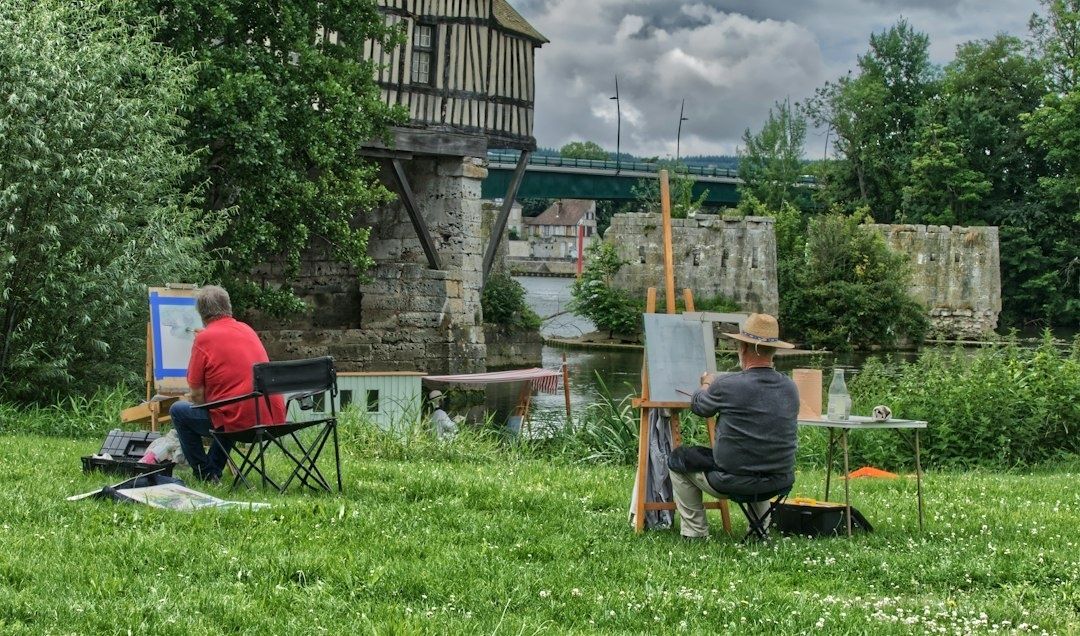
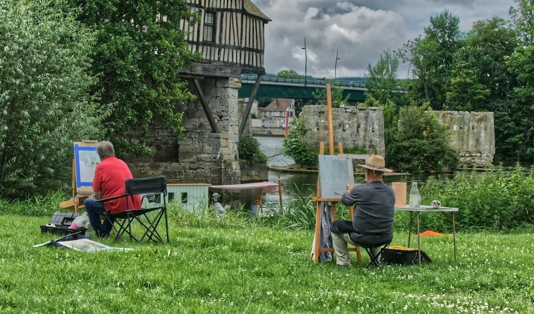
Two artists painting outdoors beside a historic riverside bridge and buildings
Working from direct observation helps artists connect converging forms with the changing color, contrast, and edge quality created by atmospheric distance.

The Structural Scaffold of Linear Convergence

Look closely at a Renaissance interior or an architectural drawing, and the apparent calm of the image rests on a disciplined system. Edges of floors, ceilings, walls, paving stones, and furniture recede toward points organized by the viewer”s eye level. During the Italian Renaissance, artists gradually developed a more systematic approach to this problem, and Leon Battista Alberti codified important principles of linear perspective in 1435. The method transformed the canvas into a theoretical window, allowing objects to become smaller and increasingly foreshortened as they move away from a fixed viewpoint. A useful overview of these historical principles appears in this authoritative account of linear perspective.

The basic vocabulary is practical rather than intimidating. The horizon line represents the viewer”s eye level, even when the horizon itself is hidden by buildings, trees, or hills. A vanishing point is the place toward which parallel lines appear to converge. Orthogonals are the receding lines that lead the eye into the scene, while transverse lines cross them and indicate intervals moving through space. One-point perspective is effective when a subject faces the viewer directly. Two-point perspective becomes more natural when the corner of a building or box turns toward the observer. Three-point perspective is useful for dramatic views looking sharply upward or downward, but it is not required for most landscape and interior studies.

The danger is not incorrect geometry alone. A drawing can obey every construction line and still feel stiff because the artist has mistaken perspective for a cage. Vanishing points are better understood as sight guides. They organize the directional energy of the composition, but they do not dictate every visible contour with equal force. Organic forms bend, surfaces interrupt one another, and the viewpoint may shift subtly as the eye explores a painting. Use convergence to anchor architecture, then allow observation to govern the irregularities that make the scene believable.

  • Place the eye level before drawing secondary details.
  • Use repeated objects, such as windows, posts, or paving stones, to test whether spatial intervals diminish convincingly.
  • Let overlaps clarify which form sits in front of another.
  • Check the scale of figures against nearby architectural or landscape landmarks.
  • Treat the vanishing point as a directional guide, not a command to force every line into submission.

Perspective also carries expressive meaning. A low horizon can give prominence to the sky and make distant terrain feel expansive, while a high horizon can emphasize the ground, a tabletop, or a nearby architectural structure. The rules are therefore inseparable from viewpoint. For a broader comparison of projection systems and their visual logic, consult this discussion of Wikipedia.

Painting the Invisible Medium of Air and Atmosphere

Linear perspective describes the path of forms through space, but it does not describe the space itself. Between the viewer and a distant tree lies a column of atmosphere. Light travels through that column, encountering particles of moisture, dust, and other matter that scatter some wavelengths and reduce the clarity of the object behind them. The painter does not need to reproduce this physics literally, but understanding its visible consequences is invaluable. Distance tends to make forms paler, cooler, less saturated, and less sharply defined.

Atmospheric color is never a fixed recipe. Under a clear blue sky, distant hills may lean toward blue or blue-violet. In overcast conditions, they may become cooler gray. At sunrise or sunset, the same layers can take on warmer pink, ochre, or lavender passages. The essential point is relational: foreground colors usually carry greater warmth and intensity, while receding colors become more closely related to the surrounding air. Mixing a measured amount of sky color into distant landforms can make them feel enveloped rather than merely painted with a lighter pigment.

Edges provide another remarkably sensitive distance cue. A near tree may have a crisp silhouette, broken bark, and individual leaves. A middle-ground tree can retain its mass while losing small accents. A far tree may merge into a horizontal band of tone. Softening every edge, however, produces mud rather than atmosphere. The most convincing work varies edge control: preserve a few sharper passages where the eye needs to pause, soften contours that turn away or recede, and use broken brushwork to suggest texture without describing every fragment.

The Mechanics of Value Compression and Spatial Planes

Value compression describes the narrowing gap between light and dark as forms move into the distance. A nearby object can contain deep shadows, bright highlights, and a broad range of intermediate notes. Atmospheric distance reduces that range, so the darkest darks rise toward the middle and the lightest lights become less distinct. A distant mountain may still have a recognizable ridge and internal color variation, but its overall value structure may occupy only a narrow band.

One practical progression is to allow four or five distinct value steps in the foreground, approximately three in the next layer, two in the middle ground, and perhaps one or one and a half in the far background. These are not rigid quotas. They are a way to notice whether the distant passage is competing with the subject nearest the viewer. Squinting at the reference or study suppresses distracting detail and reveals the large value masses that should govern the painting before texture is added.

Painter and teacher John F. Carlson”s four-angle approach offers a useful way to organize broad illumination. It distinguishes the sky, the ground plane, upright planes such as trees or walls, and slanted planes such as hillsides, roofs, or banks. Each plane receives light differently, so a coherent landscape depends on more than simply making distant objects pale. The same principle can be applied to graphic representation and visual construction, as discussed in this historical overview of perspective across art history.

Spatial area Value behavior Color and edge behavior
Foreground Broadest light-dark range and strongest accents Warmer, richer, more saturated, with selective hard edges
Middle ground Reduced contrast with readable mass divisions Moderately cooler and quieter, with mixed edge sharpness
Background Narrow value range, sometimes nearly unified Cooler or air-colored, less saturated, with softened contours

Compression does not mean draining a painting of color. A group of hues can share a similar value while differing in temperature and saturation. This allows a distant field, sky, or misty hillside to remain visually alive without breaking the spatial hierarchy. Value carries the structural burden, while hue and saturation provide the quieter rhythms that keep the atmosphere from becoming flat or gray.

A Practical Studio Sequence for Layered Depth

Begin with a light, economical drawing. Establish the eye level, identify the principal vanishing direction, and indicate the largest shapes before describing any surface detail. In a landscape, place the horizon with intention rather than automatically centering it. In an interior, lightly mark the floor, ceiling, and dominant architectural edges. The purpose of this first stage is not to finish the drawing but to confirm that the composition has a believable spatial skeleton.

  1. Establish the viewpoint. Mark the eye level and place the main convergence guides. Use loose lines to locate the largest foreground, middle-ground, and background masses.
  2. Block the value structure. Paint or draw the broadest light and dark shapes first. Reserve the strongest contrast and darkest accents for the foreground or focal area, while keeping distant planes within a narrower range.
  3. Unify structure and atmosphere. Shift distant colors toward the air, soften selected edges, reduce unnecessary texture, and reinforce only those lines that clarify the composition.

During the block-in, work from the general to the particular. A large, simplified tree mass is more useful than a collection of carefully rendered leaves if the value relationship is still unresolved. Similarly, a broad wash for a receding mountain is more informative than a detailed contour that has not yet been integrated with the sky. Grouping forms protects the sense of distance because nature itself often presents faraway objects as connected shapes rather than isolated items.

The final pass should be selective. Add sharper edges where the eye should rest, warmer notes where a form approaches, and small accents that describe scale without scattering attention everywhere. If the painting feels flat, do not immediately add detail. First inspect the temperature sequence, the value range, the spacing between repeated objects, and the overlap of planes. Often the missing depth is a structural or atmospheric relationship, not a shortage of brushwork.

Bring Living Space to Your Easel

A convincing spatial illusion emerges when the two systems support one another. Linear perspective gives the scene an underlying order, directing receding surfaces toward a coherent viewpoint. Atmospheric perspective then makes that order breathe by acknowledging the veil of air between near and far. Without geometry, forms may drift or lose scale. Without atmosphere, they may remain diagrammatically correct but optically stranded on the surface.

Practice both systems through close observation rather than mechanical measurement alone. Study how a row of trees changes size, how a road narrows, how a distant roof loses contrast, and how the same color shifts when it moves from sunlight into haze. On the canvas, build the space in layers, then adjust those layers until structure, light, and air agree. The goal is not to imitate a formula, but to make the painted surface feel like a breathable window through which three-dimensional light continues beyond the frame.

Beyond Surface Mimicry: How to Reverse-Engineer Master Paintings

The Anatomy of Visual Inquiry

A master study becomes transformative at the moment it stops being a polite imitation. Passive copying follows the visible surface, reproducing colors, contours, and small passages as though the painting were a flat image to be transcribed. Active structural deconstruction asks a more consequential question: what sequence of decisions made this image coherent? The painter studies the organization of light, the placement of large shapes, the direction of movement, the hierarchy of edges, and the selective omissions that allow the image to breathe.

Novice painters often become trapped in micro-rendering because detail offers an immediate sense of progress. A carefully described eyelash, fold, or leaf can feel like evidence of diligence, even when the head, figure, or landscape is structurally misplaced. Yet a convincing painting does not begin with isolated facts. It begins with relationships. If the value pattern is weak, the contours uncertain, and the focal area undifferentiated from its surroundings, increasingly refined detail merely polishes an unstable foundation.

Every accomplished painting is a crystallized record of visual problem-solving. Its finished surface conceals decisions about proportion, compression, rhythm, depth, material, and attention. A museum visit can therefore become a form of forensic looking. Rather than asking only what a painting depicts, examine how it organizes perception. This roadmap treats the master copy as a diagnostic instrument, helping self-directed artists inherit a painter”s thought process without borrowing the artist”s identity.

Uncovering Hidden Scaffolding Beneath the Surface

Look closely at a polished painting and the cosmetic finish can seem complete, almost inevitable. Beneath it, however, lies an armature of axes, masses, directional rhythms, and revisions. A hand may have shifted, a shoulder widened, or a head tilted before the final contour settled into place. These changes, known as pentimenti, are not failures concealed by history. They are evidence of active searching, proof that the image was constructed through adjustment rather than delivered fully formed.

Technical examination makes some of this searching visible. Infrared reflectography can reveal underdrawings, repainting, and other information hidden beneath the upper paint layers. Comparative research on infrared reflectography and pulsed thermography shows that the visibility of underdrawing depends not only on the materials involved but also on imaging conditions and signal quality. For the studio artist, the lesson is direct: the apparently effortless surface may rest on a provisional network of lines and shapes that remained flexible while the image developed.

Historical studio practice likewise treated drawing as an architecture of volume. The first marks were not necessarily attempts to perfect an outline. They established proportion, balance, planes, gesture, and the relation of one mass to another. In a contemporary master study, begin by searching for that architecture rather than chasing contour accuracy.

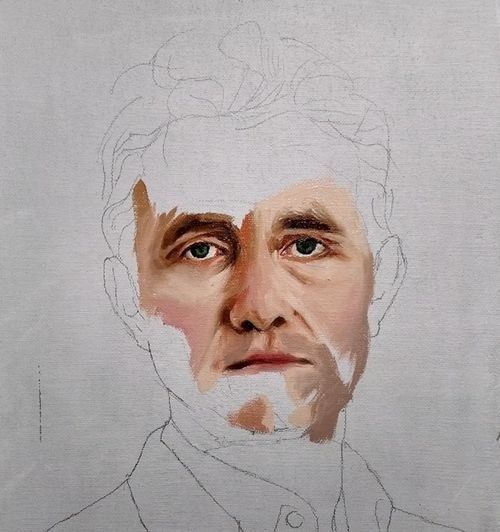
Partially painted portrait study with visible underdrawing and unfinished clothing
A structural study keeps proportion, gesture, and value relationships open long enough for the painting”s larger decisions to be tested.
  • Identify the dominant vertical, horizontal, and diagonal divisions.
  • Reduce the subject to a few interlocking masses before describing its edges.
  • Mark the central axis of figures, heads, limbs, or architectural forms.
  • Trace repeated rhythms, such as aligned shoulders, branches, folds, or gaze directions.
  • Note where the artist allows construction lines to disappear beneath later passages.

This approach turns the copy into a conversation with method. A structured tradition of master study can be explored through historical master study and its broader context on Wikipedia, but the essential practice remains available in any studio: separate the visible result from the decisions that produced it. A limited structural sketch may teach more than a painstaking replica if it exposes why the composition holds together.

Seeing in Values Before Seeing in Details

Before color becomes descriptive, it functions architecturally. A painting”s light and dark shapes establish its weight, depth, atmosphere, and emotional temperature. Tonal massing means grouping related values so that the viewer reads a coherent design rather than a collection of unrelated accents. In a portrait, the shadow side of the head may operate as one broad shape, even though it contains cheek, hair, ear, and neck. In a landscape, distant trees, mountains, and cloud shadows may be compressed into a single family to preserve spaciousness.

Squinting is a simple but powerful diagnostic. When the eyes narrow, small contrasts diminish and the major value families remain. A thumbnail made from this view reveals whether the focal area is genuinely supported by the composition or merely surrounded by busy marks. Value mapping can then clarify the image further by reducing it to three, four, or five tones. The question is not whether every local color has been preserved, but whether the large relationships still carry the subject when detail is removed.

The viewer”s eye moves through a hierarchy, not an equal field of information. Strong contrast, sharper edges, distinctive color, and concentrated detail tend to attract attention. If every passage is equally crisp and dark, the painting loses direction. The following comparison helps distinguish additive rendering from structural massing.

Additive rendering Structural massing
Builds detail before confirming the major pattern Establishes large light and shadow groups first
Treats every object as equally important Creates a clear focal hierarchy
Preserves local changes even when they fragment the image Compresses related values to strengthen unity
Uses edges with similar sharpness throughout Varies lost, soft, firm, and accented edges
Measures success by visible finish Measures success by readable structure at a distance

Stroke economy depends on this foundation. If the large value pattern is correct, a few marks can suggest a surprisingly complex form. If the pattern is wrong, additional brushwork only distributes confusion more elaborately.

The Logic of Stroke Economy and Intentional Marks

Stroke economy is not simply speed, and it is not an excuse for careless execution. It is the ability to make a limited number of marks carry several kinds of information at once: form, light, material, gesture, and atmosphere. John Singer Sargent”s broad passages often describe an entire plane with a single confident movement. Gregory Manchess similarly demonstrates how implied detail can preserve clarity while allowing the surface to remain active. The viewer completes what the brush only suggests.

This economy is easier to understand when compared with photography. A photograph records a dense field of specific information, while a painting can select, suppress, and rearrange. A hand may be indicated by a turn of value and one angular accent rather than a fully modeled inventory of knuckles. Hair can become a directional mass with a few breaks of light. The omission is not a lack of knowledge. At its best, it is evidence that knowledge has been edited.

Many painters resist this editing because precision feels safer. Over-control often disguises anxiety: the fear that a bold mark cannot be corrected, or that a simplified passage will expose insufficient understanding. Yet the goal is not to abandon control. It is to place control earlier, in the decisions about proportion, value, edge, and emphasis, so that the final marks can remain comparatively free. The practical variables described in How to Paint Looser include brush handling, pressure, paint consistency, surface, speed, and the distance at which the brush is held from the ferrule.

  1. Choose a small subject and describe it with ten deliberate strokes, prioritizing gesture, light direction, and the largest color relationships.
  2. Repeat the study with a different brush pressure, observing how a loaded mark and a lightly dragged mark alter the sense of form.
  3. Paint one passage at full speed and another slowly, then compare where energy, softness, or overworking has entered.
  4. Mix only part of each color on the palette or surface so that the stroke retains variation rather than becoming uniformly flat.
  5. Reserve the sharpest and most opaque marks for the focal area, allowing peripheral forms to remain implied.

After each exercise, inspect the result from a distance and ask which marks are doing genuine structural work. A stroke should not survive merely because it is attractive. It should remain because it clarifies the image, directs attention, describes a turn, or contributes to the painting”s rhythm.

A Diagnostic Protocol for Studio Study

A productive master study has a sequence. The purpose is not to reproduce the original as efficiently as possible, but to expose its decisions in a controlled order. Work from a reproduction only when direct museum access is impossible, and remember that scale, lighting, surface, and color reproduction can alter what is perceived. In a museum, follow the institution”s copyist rules, credit the original artist, never reproduce the original signature, and identify the exercise as “after” the master. Ethical clarity is part of serious study.

  1. Begin with a five-minute thumbnail value compression. Use a soft pencil, charcoal, or a broad digital brush. Reduce the painting to three or four value families. Do not draw eyelashes, leaves, buttons, or decorative edges. Test whether the composition remains legible when its descriptive information has been compressed.
  2. Chart linear vectors and the focal path. Draw the principal axes over a separate tracing layer or beside the reference. Mark the direction of limbs, architectural diagonals, gaze lines, horizon divisions, and major curves. Then indicate how these vectors lead the eye toward, around, or away from the focal area.
  3. Create a limited-palette massing study. Select a small number of colors, such as a dark neutral, a warm middle, a cool middle, and a light. Establish the largest shapes before mixing subtle transitions. Watch how edge relationships change when two neighboring masses are close in value or strongly separated.
  4. Perform a selective detail pass. Add only the accents that explain material, focal emphasis, or spatial depth. Compare each proposed mark with the original”s level of emphasis. If a peripheral detail competes with the subject, soften, simplify, or remove it.
  5. Write a process diagnosis. Record what was difficult, which relationships failed first, and where the original solved a problem with economy. This brief analysis prevents the exercise from becoming a decorative imitation and identifies the next technical study.

Museum copying traditions demonstrate why this order matters. The Metropolitan Museum of Art”s copyist program, founded in 1872, reflects a long history of learning directly from paintings, drawings, and institutional collections. The experience of studying original works also reveals practical realities that reproductions conceal: scale, surface texture, viewing distance, gallery lighting, and the physical authority of the object. Even a short sketch in front of an original can expose a structural decision that disappears on a screen.

Consider making several studies at different scales rather than one exhaustive replica. A small value map tests design, a linear diagram tests construction, and a limited-palette study tests color and edges. Together they form a more complete investigation than a single polished copy. The finished study should remain clearly identified as an educational work after the original, never as an independent claim of authorship.

Carrying Ancient Lessons Into Your Own Visual Voice

The deepest purpose of a master study is not to acquire another painter”s mannerisms. It is to discover how that painter selected, organized, simplified, corrected, and finished visual information. Sargent”s economy, Manchess”s implied detail, or the structural discipline of an atelier can become useful principles without turning into costumes. Inheritance is strongest when it occurs at the level of thought rather than surface style.

Apply the extracted principles to subjects that belong to contemporary life: a crowded train platform, a family kitchen, a weathered storefront, or a figure illuminated by a phone screen. Compress the values, chart the movement, control the focal hierarchy, and let the brush marks serve the structure. A gallery visit can then become less like a search for perfect appearances and more like a dialogue with fellow practitioners across time. Look for the choices beneath the finish, test those choices in your own work, and allow the resulting paintings to speak in a voice that is informed, deliberate, and unmistakably yours.

How Light Left the Studio: Understanding Color Temperature Through Plein-Air Painting

Stepping Away from the Bitumen Palette

Before landscape painting became an encounter with weather, many artists worked in the controlled gloom of the academic studio. Illumination was carefully managed, poses were held still, and shadows were often translated into umbers, asphaltum, bitumen, and neutral gray. These dark materials could create gravity and solidity, but they also encouraged a universal brownness, as though every recess in the world belonged to the same interior dusk. A painted shadow became less an observation than a convention.

The nineteenth-century decision to carry easel, canvas, and newly portable paint outdoors altered that habit at its foundation. Collapsible metal paint tubes made prepared colors easier to transport and preserve, while lighter equipment allowed artists to stand directly before a field, river, street, or hillside. As the history of painting en plein air makes clear, this was not simply a change of location. It transformed color temperature from an academic formula into a living perceptual science, governed by the continual exchange between warm sunlight, cool sky light, reflected color, and moving atmosphere.

The Great Escape into Daylight

Portable materials did not create the desire to paint outdoors, but they made sustained outdoor observation far more practical. Earlier artists had made studies in the open air, yet the combination of manufactured paint tubes, compact easels, and transportable palettes gave landscape painters a new freedom. Instead of remembering a view after returning to the studio, an artist could watch the scene change while the brush was still moving.

The cultural effect was considerable. Working directly before the motif encouraged painters to value immediacy, local color, and the evidence of a particular hour. A tree was no longer merely “green,” and a road was not simply “brown.” Each depended on season, weather, reflected surfaces, and the direction of the sun. Plein-air practice also made the artist more visibly present in the landscape. The painting became a record not only of a place, but of a temporary encounter with it.

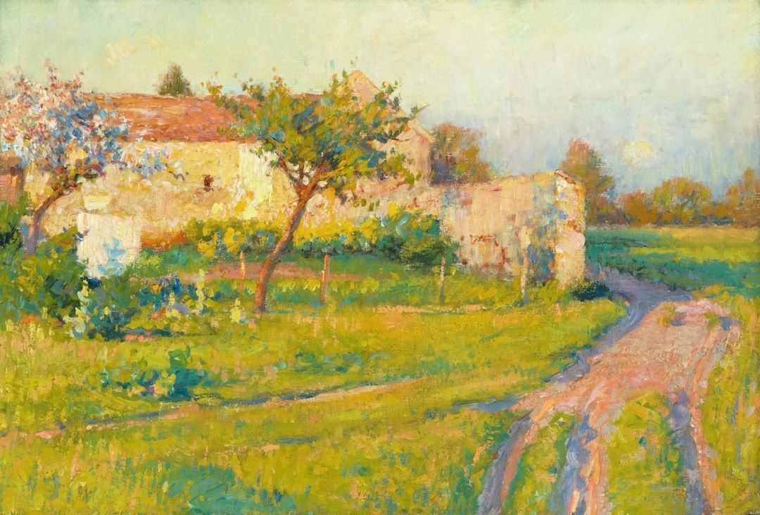
Sunlit impressionist countryside with a winding dirt path and orchard
Painting outdoors trains the eye to recognize how changing light reshapes color, depth, and atmosphere from one moment to the next.

Indoor illumination tends to remain relatively stable, even when it is imperfect. Natural light is restless. Clouds soften and cool a field; a break in the weather suddenly warms it; pale walls reflect sunlight into shadow; water lifts fragments of blue or green into nearby forms. Outdoors, the painter must continually compare one passage with another rather than assign isolated labels to colors.

  • Studio light is usually controlled, directional, and comparatively consistent.
  • Daylight combines direct sunlight with diffuse illumination from the sky.
  • Outdoor color changes with time, weather, season, atmosphere, and reflected surroundings.
  • The same pigment can appear warmer or cooler according to the colors placed beside it.

That attentiveness remains central to plein-air painting today. The practice is less about copying every visible detail than about recognizing which relationships make the scene feel illuminated. A landscape painter such as Jackie Jones, whose approach emphasizes observation, atmosphere, and carefully balanced color, demonstrates how outdoor work can join structured design with a responsive, poetic sense of place.

The Optical Mystery of Blue Shadows

Look at a sunlit wall and its adjacent shadow. The shadow may appear blue, violet, or greenish, even when the material itself is warm stone or ochre plaster. In a studio tradition shaped by umber and black, this could seem surprising. Yet the outdoor effect follows a clear distribution of light. The sun supplies direct illumination, while the open sky supplies a broad field of indirect, bluish light.

When direct sunlight falls on a surface, its warmth dominates the lit plane. Where an object blocks that sunlight, the shadow is not necessarily empty of illumination. It receives light scattered through the atmosphere and light reflected from the sky. Because the sky”s visible light is commonly biased toward blue, the shadow can inherit that cooler influence. The result is not a fixed rule that every shadow must be blue, but a perceptual relationship between the warmth of the light and the relative coolness of the shade.

What the eye observes Likely color influence
Direct sunlight on a pale surface Warm yellow, orange, or golden influence
Open sky illuminating a cast shadow Cool blue or violet influence
Grass reflected into a nearby wall Green influence in the lower plane
Sunset light across the whole scene Warmth in both light and shadow, with relative contrast remaining important

Atmospheric scattering deepens this effect. Shorter blue wavelengths are dispersed through the atmosphere, which helps explain the sky”s color and its influence on outdoor surfaces. Complementary contrast also intensifies perception: a warm sunlit passage can make a neighboring cool shadow appear more distinctly blue, while the cool shadow can make the light seem more orange.

The most useful lesson is contextual. A shadow should not be painted blue because a rule demands it. It should be compared with the light around it. In a cloudy landscape, the difference may be subtle. Under a clear midday sky, it may become vivid. At sunrise or sunset, shadows can themselves appear warm, although they may still be cooler than the strongly illuminated planes. Outdoor observation replaced generalized studio convention with this more precise question: cooler or warmer than what?

Rethinking the Warm and Cool Dichotomy

Color temperature is relative rather than absolute. Red, orange, and yellow are conventionally described as warm, while blue, green, and violet are generally described as cool. But a painting is not organized by isolated categories. A lemon yellow that leans toward green may feel cooler than an orange-leaning cadmium yellow. A violet blue may appear warmer than a greenish blue. Temperature emerges through comparison, lighting, and surrounding color.

The question of ultramarine makes the point especially well. Some painters experience it as a cool blue because it belongs to the blue family; others classify it as warm because its violet tendency brings it closer to red. Cobalt may occupy a more central position, while a blue that leans toward green or violet shifts in a different direction. Neither judgment needs to be treated as a permanent scientific verdict. The practical issue is how a pigment behaves within a particular mixture and visual setting.

  • Compare colors side by side instead of judging them from memory.
  • Notice whether a pigment leans toward a neighboring hue on the color wheel.
  • Keep warm and cool versions of the primaries available for cleaner mixtures.
  • Judge the temperature of a shadow against its light, not against an abstract color chart.
  • Remember that adding white can lighten a color while also making it appear cooler or chalkier.

This logic explains the usefulness of a split-primary palette. A painter may keep a warm and cool yellow, a warm and cool red, and a warm and cool blue, then select among them according to the atmosphere being observed. Such an arrangement does not impose a rigid formula. It expands the number of relationships available, allowing a sky, reflected field, distant hill, or sunlit wall to be matched with greater sensitivity. The palette becomes a map of possible temperatures rather than a row of permanent identities.

How Nineteenth-Century Innovators Remade the Palette

Nineteenth-century landscape painters increasingly resisted the heavy reliance on black and muddy earth tones when those colors obscured the vibration of daylight. Their aim was not brightness for its own sake. It was to translate the way light appears to tremble across foliage, water, masonry, and air. Instead of mixing every shadow into a neutral dark, painters could place related but distinct colors beside one another, allowing the eye to blend them at a distance.

This approach connected practical observation with broader ideas about perception. Goethe”s color investigations emphasized the interaction of light and darkness, the psychological force of color, and the role of atmospheric conditions in what becomes visible. His attention to boundaries between light and dark helps explain why outdoor color often feels most active at transitions: along a roofline, beneath a branch, or where a sunlit bank meets a cool recess. The revolutionary techniques associated with Impressionism, described through educational resources such as the National Gallery of Art”s history of Impressionism, demonstrate how these observations altered modern painting methods.

For museum visitors, this history, supported by an Authoritative Source, changes the way a gallery wall can be read. A seemingly casual brushstroke may carry a precise temperature: a violet note preserving the coolness of a shadow, a yellow fragment enlivening reflected sunlight, or a green mark preventing a gray road from becoming lifeless. Vibrant pigments and broken brushwork were not merely decorative innovations. They were attempts to make the painting behave like perception itself, where color is registered through relationships rather than isolated facts.

Look at the Shadows on Your Morning Walk

Plein-air painting is not merely a studio technique transferred outdoors. It is a discipline of attention that can train everyday sight. On a morning walk, notice where sunlight strikes pavement directly and where buildings or trees interrupt it. The lit concrete may carry a pale warmth, while the neighboring shadow receives blue from the open sky. A dark doorway may contain reflected green from nearby foliage. These shifts are often quiet, but they are what give an ordinary street its atmosphere.

Try the same exercise with snow, where cool sky light can become unmistakable, or with leaves during golden hour, when warm illumination passes through translucent edges while deeper foliage remains relatively cool. Look for the exact moment when a color changes because its light source changes. Natural daylight is not a fixed spotlight but an ongoing dialogue between direct warmth and ambient coolness, between surface color and reflected atmosphere. Once that dialogue becomes visible, paintings of the open air begin to reveal not only where they were made, but how carefully their artists learned to see.

The Solitary Studio Mirror: How to Audit Your Own Drawings Without an Instructor

Breaking the Illusion of the Familiar Canvas

After several uninterrupted hours in the studio, a drawing can begin to look correct simply because it has become familiar. The eye stops examining the image as a set of relationships and starts recognizing it as an object under construction. This visual adaptation is especially persuasive in solitary practice, where no instructor interrupts the process with a fresh observation. A misplaced shoulder, a drifting axis, or a value that has grown too dark may remain unnoticed because the artist has looked at the same marks for too long.

Independent practice therefore needs deliberate interruptions rather than passive staring. A reliable mirror drawing exercise can translate the corrective spirit of the atelier into a private studio habit, while distance, defocused vision, and photographic checks offer additional perspectives. These tools do not replace judgment. They make judgment more alert by changing the conditions under which the drawing is seen.

The Mirror as an Uncompromising Critic

A handheld mirror is one of the simplest and most revealing diagnostic instruments available to a draftsman. Hold it beside the drawing and view the image through the reflection, or place the mirror at an angle so the reversed drawing appears clearly. Within seconds, familiar lines lose their authority. A head that seemed upright may lean, two eyes may sit on subtly different slopes, or the central axis of a torso may drift away from the supporting pelvis. The reversal exposes these discrepancies because the eye is no longer reading the drawing through the memory built during its creation.

This effect is cognitive as much as optical. When a drawing is viewed repeatedly in its original orientation, the brain becomes efficient at recognizing its intended subject. Recognition can override observation. Reversal interrupts that recognition and returns the image to a more unfamiliar arrangement of shapes. The exercise resembles the broader educational value of mirrored drawing activities, in which mirrored gestures and reflected forms encourage attention to line, mass, rhythm, and dominant elements rather than to a preconceived object.

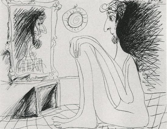
Sketch of a long-haired artist studying a portrait in a studio mirror
A deliberate change in viewpoint interrupts visual familiarity, helping artists evaluate proportion, alignment, and structure with greater objectivity.

Use the reflection as a brief audit rather than a theatrical reveal. Check one structural question at a time:

  1. Reflect the drawing and identify the first major error that becomes visible, such as a leaning centerline or uneven shoulder line.
  2. Compare the largest proportions, including the height-to-width relationship of the head, the length of the rib cage, and the position of the pelvis.
  3. Trace the primary axes with your eye, asking whether the head, sternum, navel, knees, and feet form a coherent directional flow.
  4. Return to the original view and correct only the most consequential discrepancy before checking the mirror again.

The mirror is particularly useful for anatomy because the body depends on alignment even when it is asymmetrical. It does not demand perfect bilateral symmetry. Instead, it reveals whether an asymmetry appears intentional and supported by the pose, or whether it results from gradual drift. A five-second reflection check can expose more than another twenty minutes of concentrated rendering.

Optical Compression Through Distance and the Squint

Fine detail has a seductive presence. Individual eyelashes, fabric folds, hatch marks, and surface textures can make a drawing feel advanced while the larger arrangement remains unstable. Squinting counters this attraction by softening focus and compressing visual information. The precise edges recede, while broad masses of light and dark become more prominent. The drawing can then be judged as a composition before it is judged as a collection of descriptions.

Step back five to ten feet, depending on the size of the work and the available studio space. Half-close the eyes without straining, or allow the gaze to rest slightly beyond the paper. Notice which shapes remain legible. A successful silhouette should retain its essential character, and the dominant value pattern should still organize the image. If the figure dissolves into disconnected fragments, or if every region carries equal contrast, the drawing may need structural or tonal simplification.

Before returning to surface detail, use this checklist:

  • Can the subject be recognized from its outer contour alone?
  • Is there a clear hierarchy between the lightest lights, middle tones, and darkest darks?
  • Do the largest shadow masses read as connected forms rather than scattered patches?
  • Does the focal area receive the strongest useful contrast, or is attention pulled toward an accidental edge?
  • Are the background and subject sufficiently differentiated in value?
  • Does the drawing still communicate its pose or spatial design when viewed at a small scale?

Squinting should not become a substitute for close observation. It is a second opinion, useful at intervals throughout the session. Looking closely reveals edges and transitions; looking through softened vision reveals hierarchy. The most dependable tonal decisions survive both views. If a delicate passage works only at a distance of six inches, it may be functioning as texture rather than form.

Tools of the Diagnostic Atelier Kit

The traditional studio often relied on modest observation aids rather than elaborate technology. A mirror, a darkened reflective surface, a sighting device, and a change of distance could all interrupt habitual seeing. Modern artists can adapt these methods without turning the studio into a laboratory. Each tool is valuable because it isolates a different category of error, from proportion and perspective to tonal imbalance and compositional confusion.

Tool Best diagnostic use Typical flaw revealed
Handheld mirror Reversing the entire image quickly Slant bias, uneven proportions, anatomical misalignment
Claude glass or black glass Reducing the scene to simplified dark and light relationships Weak value grouping, excessive detail, confused focal hierarchy
Digital photograph Creating distance and viewing the work on a neutral screen Perspective skew, cropping problems, inconsistent edges and scale
Physical distance Testing silhouette and large-shape rhythm Fragmented composition, weak gesture, disconnected masses

A Claude glass, traditionally a small darkened convex or flat reflective device, can be understood today as a way of simplifying the visual field. A piece of black glass or a heavily tinted reflective surface reduces local color and detail, allowing the artist to inspect broad value relationships. It is not necessary to treat the device as historically sacred. Its usefulness lies in the perceptual reduction it creates. When the image becomes quieter, tonal structure becomes easier to discuss.

A digital photograph offers a different kind of distance. Photograph the drawing straight on, avoiding a steep camera angle, then view the image at thumbnail size or flip it horizontally. The screen removes the physical scale and studio context that may have influenced the original judgment. It can expose a page that is subtly trapezoidal, a horizon that rises unexpectedly, or a focal point that has become too centered. Perspective deserves particular attention: as lessons in perspective drawing demonstrate, inconsistent horizon levels and vanishing relationships can make a solid object appear tilted, sinking, or unstable. The purpose is not to obey rules mechanically, but to know whether a rule has been broken deliberately.

Building an Active Self-Audit Workflow

Self-critique becomes most effective when it is scheduled before fatigue turns it into an emotional reaction. Establish a pause every twenty minutes during a sustained drawing session. The interval is long enough to produce meaningful work but short enough to prevent complete visual adaptation. At each pause, leave the chair, change the viewing distance, and allow the eyes to reset before deciding what needs attention.

  1. At the first pause, inspect the mechanical structure: placement, proportion, gesture, perspective, and the relationship between major axes.
  2. At the second pause, use the mirror or a horizontal digital flip to locate asymmetry, slant, and proportional drift.
  3. At the third pause, step back and squint, judging the silhouette, value masses, focal hierarchy, and overall visual rhythm.
  4. At the final pause, examine edge quality, asking where contours should be sharp, softened, lost, or selectively emphasized.

This sequence moves from construction to interpretation. Early in the drawing, line placement and proportion deserve priority. Later, tonal balance and edge control determine whether the forms feel convincing. A common independent-practice mistake is to refine the wrong category at the wrong time, polishing a hand while the arm remains too short or deepening a shadow before the main light direction is secure. Structured pauses protect the drawing from this misplaced effort.

Emotional detachment does not mean becoming indifferent to the work. It means treating each mark as evidence rather than as a verdict on personal ability. Record observations in neutral language: “the left shoulder sits too high,” “the shadow mass breaks at the cheek,” or “the darkest accent competes with the face.” Such statements are actionable. “The drawing is bad” is not. The aim is the kind of attentive curiosity encouraged by reflective studio exercises, where artists identify dominant and subordinate elements and use that analysis to guide the next decision.

It can help to keep a small audit log beside the easel. Note the date, subject, three observations, and one correction to attempt. Over time, repeated entries reveal recurring habits. Perhaps contours become too dark too early, figures consistently lean in one direction, or backgrounds are left too close in value to the subject. These patterns are valuable because they transform vague frustration into a personal curriculum.

Cultivating the Independent Eye in Daily Practice

Mistakes become productive when they are treated as diagnostic data. A reversed image may reveal a habitual slant, a squinted view may expose an undifferentiated value field, and a photograph may show that perspective has shifted across the page. None of these discoveries invalidates the drawing. They identify the next area of attention. In a solitary studio, that shift in attitude is essential because progress depends less on constant reassurance than on accurate information.

Build the checkpoints into the next session before the first line is drawn. Set a timer for twenty minutes, keep a mirror within reach, reserve a clear place several feet from the work, and photograph the drawing at the end. Check structure first, then mass, then edges. With repetition, these actions become less like emergency corrections and more like ordinary looking. The independent eye grows through that rhythm: observe, interrupt familiarity, identify the evidence, and make one deliberate adjustment.

Before Detail: How Mastering Value Scales and Planar Lighting Builds Real Form

The Architecture of Light on Form

Many drawings become busy before they become solid. The artist adds a polished highlight to the cheek, a pattern to the fabric, or a soft gradient across a shoulder, yet the underlying mass remains uncertain. This happens when value is treated as a cosmetic rendering stage rather than as the structural blueprint of the image. Before surface detail can persuade the eye, the drawing must establish what turns toward the light, what turns away, and how each part occupies space.

Early embellishment cannot compensate for undefined geometry. Soft blending may produce an attractive atmosphere, but without a clear volumetric plan it often dissolves the planes that make a form legible. A more reliable approach begins with measured tonal relationships and deliberate lighting decisions. In that sense, value is not simply lightness or darkness on paper. It describes physical mass, the orientation of a surface, and the spatial clarity that allows a viewer to feel the object rather than merely recognize its outline. Even a simple study of an egg or folded cloth can benefit from the same discipline found in a carefully constructed value scale exercise.

Calibrating the Palette with Measured Value Scales

A value scale is often dismissed as a beginner”s warm-up, but it is more accurately understood as a calibration instrument. It trains the eye to distinguish neighboring tonal steps and trains the hand to reproduce those distinctions consistently. A well-made scale gives the artist a private reference system: it clarifies how dark the medium can become, how bright the paper can remain, and how evenly the intermediate values can be arranged. This is especially important because graphite, charcoal, ink, and digital tools each compress or expand the available range in different ways.

Constructing a scale also exposes habits that remain hidden in a finished drawing. Uneven jumps between tones reveal where contrast is being overused, while noisy patches indicate uncontrolled pressure or texture. A nine-step scale, associated with the system developed by Denman Ross in 1907, offers fine tonal distinctions, but a smaller range is often more useful during a structural block-in. Five values can be enough to describe a rounded object clearly: light, light halftone, middle, shadow, and deepest accent. As control improves, additional steps can be introduced without allowing the drawing to become muddy.

Think of the scale as a limited palette rather than a catalogue of every possible gray. Restriction creates hierarchy. When every area receives a different strength of shading, the eye has difficulty deciding what matters. A disciplined five-to-nine-step range keeps major light and shadow families intact, then reserves the darkest tones for structural emphasis. Useful principles include:

  • Set the lightest and darkest values before filling the middle range.
  • Space intermediate tones so that each step is visibly distinct.
  • Keep the darkest value selective rather than spreading it across the drawing.
  • Compare the drawing to the scale frequently instead of trusting memory.
  • Use smooth, controlled marks where a continuous surface is intended, and sharper transitions where a plane changes.

The value scale is therefore both a seeing exercise and a planning device. Before beginning a portrait, still life, or figure, decide whether the image will remain high-key and delicate or move toward a dramatic full range. Such a decision prevents accidental tonal drift. It also saves time, because the artist can solve the range and hierarchy before committing to complicated textures or local color.

Planar Analysis and the Structural Planes of Light

Look closely at an organic form and its apparent smoothness begins to reveal a sequence of turns. A cheek moves from front plane to side plane; a pear narrows through a series of subtle changes in direction; a folded sleeve breaks into ridges, troughs, and broad transitional surfaces. Planar analysis makes these changes visible by temporarily translating complex curves into connected, intentional planes. This does not mean making every subject look mechanical. It means asking where the surface changes direction and how that change alters the light.

Graphite study of a cone, sphere, and block with cast shadows
Reducing a subject to a few directional planes helps the artist predict how light will organize the entire form. This structural reading keeps later shading from becoming a collection of disconnected patches.

The physics is direct. A plane facing the primary light source receives more illumination than a plane turned obliquely away from it. A plane facing away enters the shadow family, while a plane angled toward the ground may become darker even when it remains close to another illuminated surface. The following comparison is not a rigid formula, since light size, reflectivity, and surrounding surfaces matter, but it provides a practical starting structure:

Plane orientation Likely light response Useful value assignment
Directly facing the light Strong illumination and possible highlight Lightest value or light halftone
Turning slightly from the light Reduced illumination with clear form change Middle-light value
Side-facing or oblique plane Moderate illumination and stronger modeling Middle value
Turning decisively away Entry into the form-shadow family Shadow value
Occluded plane or contact area Little direct light, often reinforced by surrounding blockage Deepest accent, used sparingly

In practice, begin with large planes rather than small anatomical or decorative information. A toy dinosaur, plaster cast, shoe, fruit, or folded cloth can all be studied this way. Establish the silhouette, identify the main directional changes, and assign broad values before refining the form. This analytical stage may initially feel less expressive than free shading, but it gives the drawing a dependable skeleton. Later marks can soften, exaggerate, or partially conceal the planes without losing their underlying logic.

The Anatomy of Edges in Communicating Spatial Volume

Edges are not merely borders; they are signals about how surfaces meet and how attention moves through an image. A hard edge is crisp and decisive, often useful where two planes intersect or where a cast shadow has a clear boundary. A firm edge is controlled but slightly less severe. A soft edge spreads the transition across a small area, supporting a rounded turn. A lost edge becomes so close in value to its surroundings that the boundary nearly disappears, allowing the viewer to infer the form rather than receiving every contour explicitly.

Edge quality should follow the behavior of the form. A box can carry several hard or firm transitions because its planes change abruptly. An egg requires broader, quieter gradations because its surface turns continuously. A cast shadow may begin with a relatively firm edge near the object and become softer as it travels across the ground, depending on the size and distance of the light source. Value contrast also affects perceived sharpness: neighboring shapes with similar values produce a subdued boundary, while a strong light-dark difference makes the edge appear more prominent.

Uniform outlines flatten a drawing because they give every boundary equal authority. They prevent the viewer from distinguishing between a plane intersection, a turning contour, a distant edge, and a shadow boundary. A more articulate edge vocabulary might include:

  • Hard edges for plane breaks, sharp cast shadows, and focal accents.
  • Firm edges for clearly described contours that remain integrated with the form.
  • Soft edges for gradual curvature and atmospheric transitions.
  • Lost edges where form recedes, values merge, or attention should be released.

Edge control is especially valuable in drawings with limited color, because it creates variety without requiring additional hues. A soft graphite transition can describe the turning of a forehead, while a narrow dark accent can clarify the meeting of a handle and a cup. The goal is not to blur everything that is rounded or sharpen everything that is structural. The goal is to make the viewer feel the rate and direction of each change in surface.

A Methodical Workflow for Building Form Before Detail

A dependable workflow postpones texture until the drawing can survive without it. This order resembles the way a sculptor establishes a mass before carving small features. Planar analysis is useful here because it can organize both observation and invention, whether the subject is a figure, animal, object, or imagined design. Work from large relationships toward small ones, and judge every later decision against the initial light structure.

  1. Block in the major spatial silhouettes. Establish the outer contour, the largest internal divisions, and the position of the object in its surrounding space. Choose a single primary light source and keep its direction consistent.
  2. Group the major light and shadow families. Use flat local values to separate illuminated planes from form shadows and cast shadows. Resist the urge to model every transition immediately.
  3. Refine secondary planes and turning forms. Introduce intermediate values where a surface rotates gradually. Use hard, firm, soft, and lost edges deliberately so that the drawing communicates both structure and depth.
  4. Introduce selective texture at focal transitions. Add pores, fabric marks, wood grain, metal reflections, or other surface information only after the form and lighting remain convincing in simplified form.

At each stage, step back and reduce the image mentally to a thumbnail. If the large light and shadow pattern still reads, the construction is working. If the drawing depends on tiny accents to appear dimensional, return to the previous stage and repair the major value relationships. Texture has its own visual language, but it cannot replace structure. Leather, skin, metal, and fabric become believable only when their marks follow a surface that already turns convincingly through space.

A useful test is to squint at the drawing or view it at a distance. Fine details should disappear while the primary masses remain. Another test is to convert the study into five values, either physically or digitally. This reduction reveals whether the focal point is supported by contrast and whether the shadow family has been kept coherent. Such checks may seem methodical, but they protect the drawing from the seductive noise of premature finish.

Bring Sculptural Mass to Your Daily Sketchbook Practice

The essential shift is from cosmetic shading to architectural lighting. Instead of asking which mark will make a surface look interesting, ask which plane is turning, which value family it belongs to, and how the edge should behave at that transition. This mindset does not eliminate expressive mark-making or material specificity. It gives those qualities a stable stage on which to act.

For regular practice, choose simple household forms such as an egg, mug, box, shoe, or folded towel. Draw each one with only five values under a single lamp. First map the silhouette and cast shadow, then divide the form into broad planes, then adjust edge quality. Repeat the exercise from a different light direction or with the object rotated. Over time, this practice builds more than technical accuracy. It develops confidence in the decisions that make a drawing feel solid before the viewer notices its surface.

Clothing Options for Fitness Educators

Fitness educators play a vital role in motivating and guiding individuals toward healthier lifestyles. Besides their understanding and professionalism in fitness matters, most educators are particular regarding the choice of attire. Why should a trainer’s attire matter? Looks aside, selecting the right clothes executes their primary role effectively. Here is a list of clothes that should be in every fitness trainer’s closet.

Gym Shirts

Gym shirts are a staple for fitness educators. As an educator, you should opt for gym shirts or tops from aim’n with excellent moisture-wicking properties for optimal comfort and focus during intense workouts. Better yet, gym shirts allow freedom of movement, which is essential for demonstrations and group workouts.

Compression Leggings

Compression leggings come in handy in supporting muscles and reducing fatigue during long periods of activity. This class of fitness gear is particularly handy in enhancing flexibility while executing workout movements, which is ideal for instructors demonstrating movements requiring precise form.

Breathable Footwear

Proper footwear is crucial for fitness educators who are constantly on their feet. Choose sneakers that provide adequate cushioning, stability, and breathability. This helps prevent discomfort and potential foot issues, allowing instructors to move seamlessly.

Accessory Considerations

Accessories such as headbands, wristbands, fitness trackers, and supportive workout gloves can enhance comfort and functionality. They help keep sweat and hair out of the way while adding a touch of personal style.

Overall, fitness educators should prioritize comfort, functionality, and professionalism when selecting their clothing. Gym shirts, along with compression leggings, appropriate footwear, and flexible bottoms, play an invaluable role in allowing instructors to lead their classes with confidence and ease.

Getting it Right With Fitness Education Gear

If you want to be a top fitness trainer, you must get the proper training education first. Besides choosing a good school, having the right gear during your learning process is crucial. The comfort sets your mind free and allows you to focus on the lessons at hand.

With so many online stores present, buying clothing might seem like an easy task. But it isn’t. You need to purchase quality Aim’n women’s activewear sets that are specifically designed for the serious fitness enthusiast. The brand is fully dedicated to fitness wear for women. It has a research process that aims to develop beautiful, comfortable and functional designs. Whether you are looking for tights, sports bras, dresses or swimwear, they have you covered. All these come in different styles to suit your taste.

Another reason fitness training educators recommend Aim’n products is their versatility. You can wear the same tights you had in class to the grocery without looking sweaty or indecent. This makes things a lot easier for learners who have to juggle classes and other errands. Everything is available online, with an option to select your location for a more customized shopping experience.