
How Light Left the Studio: Understanding Color Temperature Through Plein-Air Painting
Stepping Away from the Bitumen Palette
Before landscape painting became an encounter with weather, many artists worked in the controlled gloom of the academic studio. Illumination was carefully managed, poses were held still, and shadows were often translated into umbers, asphaltum, bitumen, and neutral gray. These dark materials could create gravity and solidity, but they also encouraged a universal brownness, as though every recess in the world belonged to the same interior dusk. A painted shadow became less an observation than a convention.
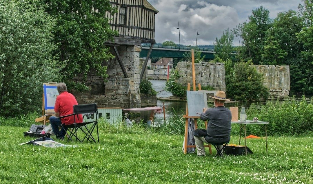
The nineteenth-century decision to carry easel, canvas, and newly portable paint outdoors altered that habit at its foundation. Collapsible metal paint tubes made prepared colors easier to transport and preserve, while lighter equipment allowed artists to stand directly before a field, river, street, or hillside. As the history of painting en plein air makes clear, this was not simply a change of location. It transformed color temperature from an academic formula into a living perceptual science, governed by the continual exchange between warm sunlight, cool sky light, reflected color, and moving atmosphere.
The Great Escape into Daylight
Portable materials did not create the desire to paint outdoors, but they made sustained outdoor observation far more practical. Earlier artists had made studies in the open air, yet the combination of manufactured paint tubes, compact easels, and transportable palettes gave landscape painters a new freedom. Instead of remembering a view after returning to the studio, an artist could watch the scene change while the brush was still moving.
The cultural effect was considerable. Working directly before the motif encouraged painters to value immediacy, local color, and the evidence of a particular hour. A tree was no longer merely “green,” and a road was not simply “brown.” Each depended on season, weather, reflected surfaces, and the direction of the sun. Plein-air practice also made the artist more visibly present in the landscape. The painting became a record not only of a place, but of a temporary encounter with it.
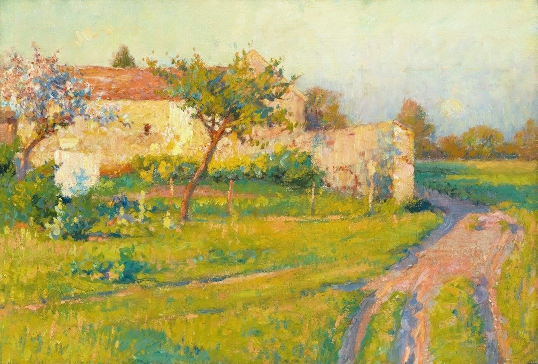
Indoor illumination tends to remain relatively stable, even when it is imperfect. Natural light is restless. Clouds soften and cool a field; a break in the weather suddenly warms it; pale walls reflect sunlight into shadow; water lifts fragments of blue or green into nearby forms. Outdoors, the painter must continually compare one passage with another rather than assign isolated labels to colors.
- Studio light is usually controlled, directional, and comparatively consistent.
- Daylight combines direct sunlight with diffuse illumination from the sky.
- Outdoor color changes with time, weather, season, atmosphere, and reflected surroundings.
- The same pigment can appear warmer or cooler according to the colors placed beside it.
That attentiveness remains central to plein-air painting today. The practice is less about copying every visible detail than about recognizing which relationships make the scene feel illuminated. A landscape painter such as Jackie Jones, whose approach emphasizes observation, atmosphere, and carefully balanced color, demonstrates how outdoor work can join structured design with a responsive, poetic sense of place.
The Optical Mystery of Blue Shadows
Look at a sunlit wall and its adjacent shadow. The shadow may appear blue, violet, or greenish, even when the material itself is warm stone or ochre plaster. In a studio tradition shaped by umber and black, this could seem surprising. Yet the outdoor effect follows a clear distribution of light. The sun supplies direct illumination, while the open sky supplies a broad field of indirect, bluish light.
When direct sunlight falls on a surface, its warmth dominates the lit plane. Where an object blocks that sunlight, the shadow is not necessarily empty of illumination. It receives light scattered through the atmosphere and light reflected from the sky. Because the sky”s visible light is commonly biased toward blue, the shadow can inherit that cooler influence. The result is not a fixed rule that every shadow must be blue, but a perceptual relationship between the warmth of the light and the relative coolness of the shade.
| What the eye observes | Likely color influence |
|---|---|
| Direct sunlight on a pale surface | Warm yellow, orange, or golden influence |
| Open sky illuminating a cast shadow | Cool blue or violet influence |
| Grass reflected into a nearby wall | Green influence in the lower plane |
| Sunset light across the whole scene | Warmth in both light and shadow, with relative contrast remaining important |
Atmospheric scattering deepens this effect. Shorter blue wavelengths are dispersed through the atmosphere, which helps explain the sky”s color and its influence on outdoor surfaces. Complementary contrast also intensifies perception: a warm sunlit passage can make a neighboring cool shadow appear more distinctly blue, while the cool shadow can make the light seem more orange.
The most useful lesson is contextual. A shadow should not be painted blue because a rule demands it. It should be compared with the light around it. In a cloudy landscape, the difference may be subtle. Under a clear midday sky, it may become vivid. At sunrise or sunset, shadows can themselves appear warm, although they may still be cooler than the strongly illuminated planes. Outdoor observation replaced generalized studio convention with this more precise question: cooler or warmer than what?
Rethinking the Warm and Cool Dichotomy
Color temperature is relative rather than absolute. Red, orange, and yellow are conventionally described as warm, while blue, green, and violet are generally described as cool. But a painting is not organized by isolated categories. A lemon yellow that leans toward green may feel cooler than an orange-leaning cadmium yellow. A violet blue may appear warmer than a greenish blue. Temperature emerges through comparison, lighting, and surrounding color.
The question of ultramarine makes the point especially well. Some painters experience it as a cool blue because it belongs to the blue family; others classify it as warm because its violet tendency brings it closer to red. Cobalt may occupy a more central position, while a blue that leans toward green or violet shifts in a different direction. Neither judgment needs to be treated as a permanent scientific verdict. The practical issue is how a pigment behaves within a particular mixture and visual setting.
- Compare colors side by side instead of judging them from memory.
- Notice whether a pigment leans toward a neighboring hue on the color wheel.
- Keep warm and cool versions of the primaries available for cleaner mixtures.
- Judge the temperature of a shadow against its light, not against an abstract color chart.
- Remember that adding white can lighten a color while also making it appear cooler or chalkier.
This logic explains the usefulness of a split-primary palette. A painter may keep a warm and cool yellow, a warm and cool red, and a warm and cool blue, then select among them according to the atmosphere being observed. Such an arrangement does not impose a rigid formula. It expands the number of relationships available, allowing a sky, reflected field, distant hill, or sunlit wall to be matched with greater sensitivity. The palette becomes a map of possible temperatures rather than a row of permanent identities.
How Nineteenth-Century Innovators Remade the Palette
Nineteenth-century landscape painters increasingly resisted the heavy reliance on black and muddy earth tones when those colors obscured the vibration of daylight. Their aim was not brightness for its own sake. It was to translate the way light appears to tremble across foliage, water, masonry, and air. Instead of mixing every shadow into a neutral dark, painters could place related but distinct colors beside one another, allowing the eye to blend them at a distance.
This approach connected practical observation with broader ideas about perception. Goethe”s color investigations emphasized the interaction of light and darkness, the psychological force of color, and the role of atmospheric conditions in what becomes visible. His attention to boundaries between light and dark helps explain why outdoor color often feels most active at transitions: along a roofline, beneath a branch, or where a sunlit bank meets a cool recess. The revolutionary techniques associated with Impressionism, described through educational resources such as the National Gallery of Art”s history of Impressionism, demonstrate how these observations altered modern painting methods.
For museum visitors, this history, supported by an Authoritative Source, changes the way a gallery wall can be read. A seemingly casual brushstroke may carry a precise temperature: a violet note preserving the coolness of a shadow, a yellow fragment enlivening reflected sunlight, or a green mark preventing a gray road from becoming lifeless. Vibrant pigments and broken brushwork were not merely decorative innovations. They were attempts to make the painting behave like perception itself, where color is registered through relationships rather than isolated facts.
Look at the Shadows on Your Morning Walk
Plein-air painting is not merely a studio technique transferred outdoors. It is a discipline of attention that can train everyday sight. On a morning walk, notice where sunlight strikes pavement directly and where buildings or trees interrupt it. The lit concrete may carry a pale warmth, while the neighboring shadow receives blue from the open sky. A dark doorway may contain reflected green from nearby foliage. These shifts are often quiet, but they are what give an ordinary street its atmosphere.
Try the same exercise with snow, where cool sky light can become unmistakable, or with leaves during golden hour, when warm illumination passes through translucent edges while deeper foliage remains relatively cool. Look for the exact moment when a color changes because its light source changes. Natural daylight is not a fixed spotlight but an ongoing dialogue between direct warmth and ambient coolness, between surface color and reflected atmosphere. Once that dialogue becomes visible, paintings of the open air begin to reveal not only where they were made, but how carefully their artists learned to see.
By Magnus
- 23, Sep, 2026
- 0 Comments