
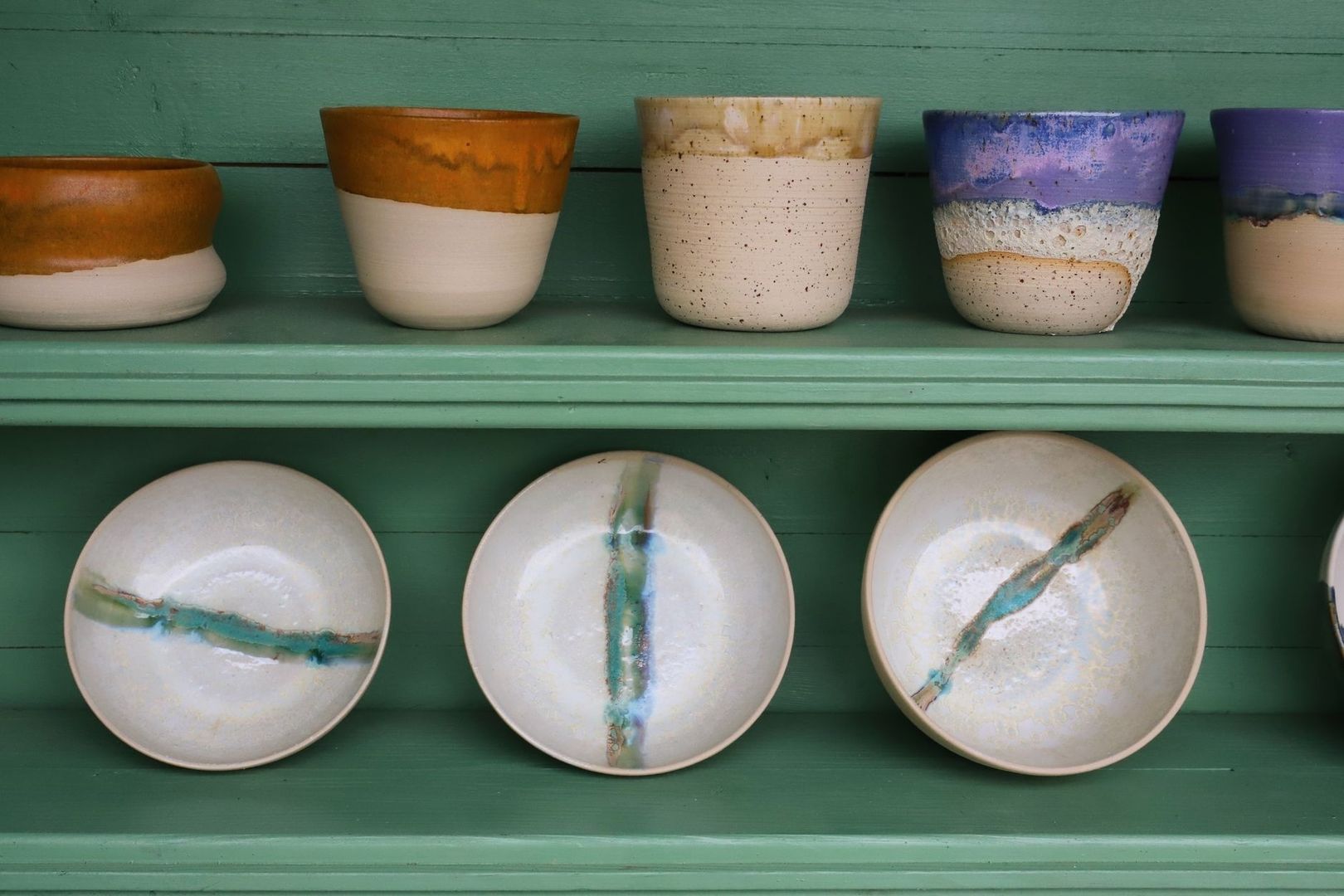
Slipware and Vernacular Glazes Across Five Centuries at Ehlers Samlingen

Clay and Domestic Life Across Five Centuries

In Haderslev, a 1577 half-timbered merchant house gives domestic pottery an unusually vivid setting. The building at Slotsgade 20 houses Ehlers Samlingen, described as Northern Europe”s largest pottery collection, with objects spanning approximately five centuries. Its wooden beams, Renaissance panel paintings, and painted ceilings create a compelling contrast with the vessels on display. Earthenware that once stood beside a hearth, pantry shelf, or kitchen table can be viewed here as both historical evidence and carefully made design.

The collection invites a change in scale. A storage jar may appear modest, yet its rounded body, irregular glaze, and hand-drawn ornament record choices about materials, labor, taste, and use. Across Scandinavia, humble red earthenware transformed functional necessity into visual expression. Pots held food, carried liquids, marked celebrations, and supported communal rituals, while their surfaces gave makers room for rhythm, humor, color, and gesture. At Ehlers Samlingen, the lineage leads from utilitarian household vessels toward the freer, more expressive language of early modernism.
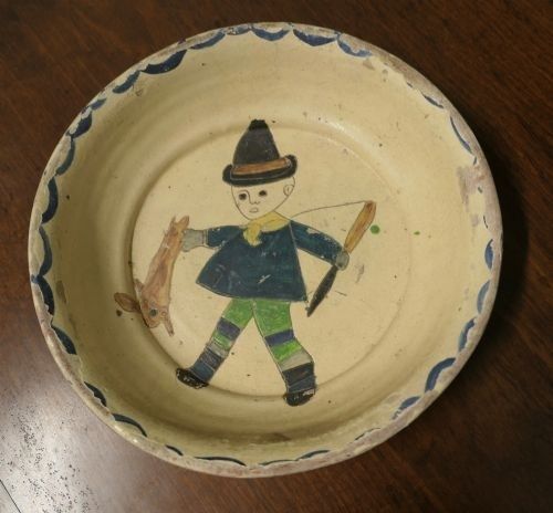
Antique slipware dish with a painted child and blue scalloped rim
Across five centuries, humble vessels turned everyday acts of storing, serving, and sharing into records of regional taste and communal life.

The Chemistry of Regional Lead Glazes and Slip Trailing

Look closely at Scandinavian red earthenware and the surface often seems to hold its own light. That effect came from a combination of porous, iron-rich clay and a low-fired lead glaze. The body could burn to shades of red, orange, or warm brown, while the glaze softened the surface into transparent amber, yellow, green, or brown. Because lead compounds melt at relatively low temperatures, they were practical for traditional earthenware kilns. They also produced a glossy coating that made vessels easier to clean and gave decoration a striking visual depth.

Traditional glaze recipes were not standardized industrial formulas. They depended on local clay, available minerals, ash, sand, and the experience of individual workshops. A potter adjusted the mixture according to the character of the clay body, the thickness of application, and the heat of the firing. Small changes could produce dramatic results: a thin coating might reveal the color and texture beneath, while a heavier application could pool in incised lines and recesses. The chemistry therefore became visible as atmosphere, variation, and surface tension.

One of the most distinctive decorative processes was slip trailing, known in Danish as hornglasering. A liquid mixture of finely prepared clay, or slip, was placed in an animal horn fitted with a narrow opening. The potter squeezed and guided the horn across the damp vessel, drawing lines, dots, loops, leaves, and flowing bands. Unlike painted decoration, slip trailing has physical volume. The raised line catches the glaze differently from the surrounding clay, so the design becomes legible through both color and relief.

  • Clay body: the fired earthenware beneath the decoration and glaze, often marked by local mineral content.
  • Slip: liquid clay used to build up contrasting lines or broader areas of ornament.
  • Lead glaze: a low-temperature glassy coating that intensifies color and protects the porous body.
  • Firing: the controlled heating process that determines hardness, color, gloss, and the final relationship between body and glaze.

Modern scientific examination helps conservation specialists and archaeologists understand the precise material properties, chemical stability, and durability of historic glazes. Beyond visual inspection, chemical analysis and micro-stratigraphy clarify how raw materials were compounded, fired, and altered through daily domestic use. For instance, an archaeometric study on Renaissance lead-glazed ceramics from southern Denmark investigated the release of lead and the susceptibility of regional wares to acid etching, offering valuable insight into how glaze recipes responded to the storage of acidic foodstuffs. Such scientific research demonstrates how workshop compounding, kiln conditions, and functional demands shaped the material history of historical earthenware in ways that remain invisible to the naked eye in a display case.

The wider history of lead-glazed pottery is also more interconnected than a simple story of imported influence. Research on medieval Danish pottery compares fabric, form, glaze, decoration, archaeological context, and distribution across Denmark, England, Sweden, the Netherlands, Belgium, and France. Some vessels appear to reflect English or French connections, while others point toward the Low Countries or local South Scandinavian production. Among the most revealing objects are anthropomorphically decorated jugs, whose faces and moulded features show that Danish workshops were not merely copying foreign examples. They were adapting circulating ideas into distinct regional forms.

Ritual in the Kitchen with Barselspotter and Maternity Vessels

Some of the most moving objects in a pottery collection are those tied to a precise human occasion. The barselspotte, or maternity pot, belonged to a Nordic tradition in which a vessel carrying nourishing food was brought to a woman who had recently given birth. The pot was therefore more than a container. It was part of a social practice that connected households, neighbors, relatives, and village life through an act of care.

The customary food was often a restorative groat soup, a substantial dish suited to recovery after childbirth. Its movement from one kitchen to another gave the pot a ceremonial role. The vessel had to carry food safely, but its appearance could also communicate generosity and belonging. A decorated pot placed before a new mother made domestic skill visible, turning nourishment into a shared public gesture while keeping the center of attention within the household.

Historic Danish records preserve this custom as part of folk culture, and the national encyclopedia entry on the barselspotte helps place the vessel within its wider social setting. The object”s significance lies precisely in the meeting of practical and symbolic functions. It held soup, yet it also carried expectations about hospitality, female networks, celebration, and the responsibilities surrounding birth.

Feature Practical role Visual or social significance
Rounded body Held a generous quantity of soup or porridge Suggested abundance, warmth, and domestic care
Glazed interior Reduced absorption and made cleaning easier Displayed the workshop”s control of color and finish
Loop or sturdy handle Supported carrying between households Reinforced the vessel”s role in communal exchange
Slip decoration Added a raised, durable surface design Gave an everyday object personal and regional character

Comparing maternity vessels across regions and centuries reveals how much local identity could be expressed within a shared form. One workshop might favor broad bands and restrained dots, while another used scrolling foliage, energetic trailing, or contrasting glaze pools. Differences in clay color, rim shape, handle construction, and decoration may reflect changing fashions, available materials, and the hands of particular makers. The vessels should not be treated as anonymous examples of folk craft. Their variations are evidence of active decision-making.

At Ehlers Samlingen, kitchenware gains historical force because it is shown alongside the broader development of pottery. Soup pots, plates for fish dishes, storage vessels, and decorated jugs establish a material map of everyday life. The viewer can ask practical questions first: how was the object lifted, filled, poured, or washed? Then the surface opens a second line of inquiry. Why does a maker emphasize a particular band or motif? What does the glaze conceal, and what does it reveal? Such looking restores the intelligence embedded in domestic objects.

Thorvald Bindesboll and the Modernist Transformation of Slipware

Thorvald Bindesbøll”s ceramics demonstrate what happens when vernacular methods are treated as a source of invention rather than as a fixed historical style. Trained as an architect at the Royal Danish Academy of Fine Arts and graduating in 1876, Bindesbøll turned increasingly toward ceramics after finding limited opportunities in architecture. He began working at Frauens Lervarefabrik in 1880, experimented at Johan Wallmann”s pottery from 1883, and joined G. Eifrig at Københavns Lervarefabrik in 1891.

His 1893 glazed earthenware dish, now in The David Collection, belongs to an especially important period. The form is circular and disciplined, yet the decoration refuses quiet symmetry. Deep clay incisions, a rough craquelured surface, a grooved framing band, and a curved multi-armed pattern create a surface full of movement. The dish does not simply display an image. It makes the act of decoration physically apparent, as though the maker”s hand has set rhythm into the clay.

Bindesbøll”s method depended on collaboration. Professional potters formed jars and dishes according to his designs, while he worked directly on the wet clay with tools and fingers, carving, scratching, and applying glazes. He used a restricted palette, but the limited colors intensified the relationship between line, texture, and relief. Slip could be poured or guided across the surface, allowing decoration to spread with a sense of controlled accident. What stands out is not a polished imitation of historical pottery, but a deliberate embrace of material irregularity.

  • Carving: deep cuts exposed the clay body and created shadows beneath the glaze.
  • Scratching: finer marks gave the surface a drawn, almost graphic energy.
  • Slip pouring and trailing: liquid clay produced raised paths that could curve, branch, or pool.
  • Restricted glazing: coordinated colors allowed texture and movement to remain visually dominant.

The connection to earlier Scandinavian pottery is especially clear in the balance between utility and expressive surface. Bindesbøll favored jars and circular dishes, familiar forms that could enter domestic life without becoming conventional. His innovation lay in making their surfaces active. The vessel became a site of gesture, where organic and arabesque forms could replace literal imagery and where the irregularities of handwork became signs of artistic presence.

This transformation helped establish a foundation for modern Danish ceramic design. Bindesbøll initially drew on Far Eastern sources, but developed a personal non-figurative language that resisted strict historical classification. His work was shown at the 1900 Paris Exposition Universelle, alongside his silver designs, and later art historians recognized his unusual originality. The significance of his ceramics is not that they abandoned tradition. Rather, they showed how regional craft knowledge could be reactivated through abstraction, collaboration, and a willingness to let the material lead.

Carrying Forward the Quiet Brilliance of Nordic Earthenware

Ehlers Samlingen preserves more than a sequence of styles. Within the wooden beams of the Haderslev house, pottery becomes a record of relationships: between clay and fire, maker and user, household and community, local practice and international exchange. A lead-glazed jug can reveal trade connections; a maternity pot can evoke collective care; a Bindesbøll dish can show how the gestures of vernacular decoration entered modern art.

For visitors and ceramic enthusiasts, the most rewarding approach is to look slowly. Notice where glaze gathers, where a trailing line changes thickness, where a rim has been handled repeatedly, or where a supposedly regular form quietly departs from symmetry. Everyday pottery deserves that attention because its beauty is inseparable from use. The enduring lesson of Ehlers Samlingen is that modern design did not emerge from nowhere. Its freedom, texture, and human scale were already present in the quiet brilliance of Nordic earthenware.
Sacred Threads: Queen Margrethe II’s Modern Vestments in Haderslev Cathedral

Entering the Luminous Vault of Haderslev Domkirke

Inside Haderslev Cathedral, southern Jutland light moves across brick Gothic walls, pale stone, timber, and painted surfaces with a quiet northern clarity. The building, known locally as Haderslev Domkirke or Vor Frue Kirke, is not simply a container for worship. Its architecture creates a changing field of shadow and radiance in which every textile, metal fitting, and embroidered line acquires unusual visual force. Deeply embedded in this historic sanctuary, as described by the authoritative architectural account, the liturgical garments challenge conventional medieval motifs through a distinctly modern sensitivity to material and place.

Queen Margrethe II enters this setting not merely as a monarch, but as a designer, embroiderer, and attentive interpreter of sacred space. Her church textiles respect the inherited grammar of Lutheran worship while loosening its visual vocabulary. Instead of relying only on heraldic devices, formal crosses, or standardized historical ornament, they make room for the intimate language of leaves, petals, vines, and hand-worked surfaces. In Haderslev, that approach gives traditional liturgy a tactile regional identity. The vestments do not compete with the cathedral; they animate it, allowing Danish nature and devotional meaning to meet beneath the changing southern Jutland light.

A Royal Thread Through Sacred History

Queen Margrethe”s involvement with ecclesiastical textiles began in the mid-1970s and developed into one of the most sustained artistic practices associated with the Danish royal household. Her first major church textile project was a green chasuble for Fredensborg Palace Church. Together with white and violet chasubles, it was presented for the church”s 250th anniversary in 1976. Queen Ingrid and Princess Benedikte contributed to the needlework on the accompanying pieces, establishing from the outset that these works were collaborative objects, shaped by design, sewing, appliqué, and patient assembly.

The Queen”s later commissions extended across Denmark, Greenland, Germany, and England. They include episcopal capes, robes, chasubles in the principal liturgical colors, antependiums, altar cloths, a wedding rug, and a cover for a hymnbook. The Danish Royal House notes that she designed all of these works, while the practical embroidery and construction were sometimes undertaken with the assistance of Selskabet for Kirkelig Kunst. This distinction is important. The authority of the finished textile lies not only in its royal authorship, but also in the specialized craft required to translate a drawing or concept into a durable object suitable for worship.

Haderslev”s own ecclesiastical history gives the 2000 commission particular weight. Haderslev Stift was established in 1922, but its bishops initially relied on Brorson”s historic episcopal cope, loaned by Ribe Stift. That arrangement connected the new diocese to an older regional heritage, yet it also meant that Haderslev lacked a vestment designed specifically for its own institutional and architectural identity. Queen Margrethe”s purpose-made cope, designed for the diocese and first used at a cathedral service in October 2000, supplied that missing visual statement; the ceremonial character of such royal textiles is also evoked by Første gudstjeneste for Dronning Margrethes messehagel.

  • The diocese was established in 1922.
  • Its bishops initially used an older cope associated with Brorson, borrowed from Ribe Stift.
  • The new episcopal cope was designed by Queen Margrethe and introduced in 2000.
  • The older borrowed cope was returned to Ribe Stift in 2010.

The Anatomy of the 2000 Haderslev Episcopal Cope

Look first at the cope”s material presence. Its exterior is made from white silk and cotton, a combination that produces both crispness and softness. The pale surface reflects the cathedral”s available light rather than absorbing it, allowing the garment to sit in visual conversation with the building”s brick and stone. Its specially dyed orange lining introduces a warm interior glow, a color encountered most dramatically when the cope moves, opens, or turns during a service. The garment also includes an attached stole and clipeus, while a patchwork decoration structures the back.

The most concentrated visual statement appears in the large clasp inspired by the Luther rose. Crafted by goldsmith Bent Gabrielsen, it measures slightly more than 13 centimeters across. A white-gold cross rests on a red-gold heart, encircled by five rust-colored quartz stones set within a gold ring. The contrast between the restraint of the white ground and the jewel-like intensity of the fastening gives the cope a carefully controlled visual rhythm. Queen Margrethe carried out the sewing with embroiderers Marianne Engell and Susanne Rubebo. The result is neither a medieval revival nor a purely secular design object. It is a contemporary episcopal garment that retains recognizable Christian symbolism while translating it into Scandinavian clarity.

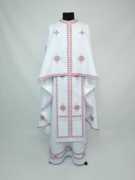
White embroidered liturgical vestment with red geometric trim on a mannequin
In contemporary church textiles, color, structure, and handwork transform inherited symbols into a visual language suited to both communal worship and a modern regional identity.
Feature Visual effect Interpretive significance
White silk-and-cotton exterior Reflects light and creates a calm field Connects the cope to white”s traditional association with major feasts
Orange lining Introduces warmth during movement Gives the garment an intimate interior dimension
Patchwork back decoration Breaks up the large surface through constructed rhythm Emphasizes handcraft and assembly rather than anonymous luxury
Luther rose inspired clasp Concentrates symbolic and material weight at the fastening Links Lutheran identity with contemporary metalwork
Rust-colored quartz stones Provides restrained flashes of earthy color Bridges precious ornament and the palette of southern Jutland

Wild Flora and Living Theology Under the Needle

What distinguishes Queen Margrethe”s ecclesiastical work is not the abandonment of tradition, but its redirection. Conventional Latin iconography often communicates through established signs: the cross, the monogram, the crown, the lamb, or the saint”s attribute. Her textiles can include such references, yet they also allow botanical forms to carry devotional atmosphere. A flowering stem does not need to function as a coded emblem to become meaningful. It may suggest growth, dependence, renewal, and the continuing presence of Creation within worship.

In this visual theology, petals and green vines make belief feel close to the ground. Their forms recall meadow plants, garden borders, and the changing vegetation of the Danish landscape. The effect is especially compelling on a garment, because the imagery moves with the wearer. A static image becomes a living field, expanding and contracting as the bishop walks, turns, raises an arm, or stands before the altar. Stitching gives the flora a physical rhythm: a line can be slightly uneven, a surface can catch light differently from one angle to the next, and a dense passage of thread can make a leaf appear almost raised from the cloth.

This regional attentiveness is also visible in the Queen”s work for Gråsten Palace Church (which closed to the public in January 2025 for a comprehensive interior restoration extending through spring 2028). When a new chasuble was consecrated there in July 2019, the garment”s connection to the surrounding landscape was made explicit. Queen Margrethe embroidered the chasuble herself, drawing inspiration from the natural environment around Gråsten Palace. The textile complements an antependium presented the previous year and includes lines from hymns such as “Som tørstig hjort,” “Alle mine kilder,” and “I al sin glans.” Its petitpoint embroidery, formed through diagonal half-cross stitches, demonstrates how text and landscape can be joined through laborious, pixel-like accumulation. The regional sensibility documented in the official Danish Royal House account of the dedication service helps clarify the broader principle at work in Haderslev: local nature is not an ornamental afterthought, but a route into reflection.

  • Observe whether plant forms are naturalistic, stylized, or abstracted.
  • Notice how green suggests living growth rather than merely filling empty space.
  • Look for the relationship between embroidered text and surrounding imagery.
  • Consider how movement changes the perceived rhythm of the design.

Appreciating Ecclesiastical Art with a Curatorial Eye

Church textiles are often encountered under imperfect viewing conditions. They may be seen from a distance, during a service, or only briefly as the clergy move through the chancel. That limitation can sharpen attention. Begin with the silhouette rather than the detail. Ask how the cope or chasuble changes the scale of the person wearing it, how its color sits against the altar, and whether the garment appears to advance toward the congregation or recede into the architecture.

Liturgical color is a practical guide to visual weight. Green is associated with Trinity time, violet with Advent and Lent, white with Christmas, Easter through Pentecost, and other feasts, while red is used at Pentecost and on St. Stephen”s Day. These colors do more than identify a season. They alter the balance of the entire sanctuary. A white cope can gather and scatter light; red can create a concentrated field of intensity; violet can deepen the atmosphere; green can settle the eye into a quieter, continuous rhythm.

  1. Start with distance. View the vestment as a whole and note its outline, dominant color, and relationship to the architecture.
  2. Move closer when possible. Look for appliqué edges, changes in stitch direction, overlaps, and areas where the fabric has been deliberately left calm.
  3. Follow the light. Metallic thread and polished fittings may flare briefly in candlelight, while matte wool or dense silk absorbs illumination.
  4. Read the surface as labor. Stitch density, tiny irregularities, and layered construction reveal how time and handwork shaped the object.
  5. Separate observation from interpretation. First describe what is visible, then consider how color, flora, text, and symbolism may function within worship.

The most rewarding details often appear at the boundary between materials. A metallic thread can sharpen the edge of a leaf, while a softer silk thread gives the interior a muted, almost painted tone. Appliqué layering creates small changes in relief, and petitpoint produces a granular surface that becomes legible only at close range. Candlelight is particularly revealing because it does not illuminate evenly. It travels across raised stitches, pauses on gold, and disappears into dark folds. In that shifting light, the vestment becomes less like a flat picture and more like a responsive architectural surface.

Encountering Living Devotion in Modern Needlework

Queen Margrethe II”s church textiles demonstrate how contemporary design can renew inherited ritual without severing its historical roots. In the Haderslev episcopal cope, white silk, orange lining, patchwork, quartz, gold, and the Luther rose form a visual identity for a diocese that once depended on a borrowed historic garment. In the wider body of her work, botanical motifs, hymn texts, and regional references bring worship into contact with the Danish landscape. The meaning is carried not only by symbols, but by texture, weight, movement, and the visible patience of the hand.

That achievement is likely to receive broader public attention through “Thread of Faith: HM Queen Margrethe”s Church Textiles,” an exhibition announced for Koldinghus from 4 June to 28 November 2027. The planned presentation of approximately 30 works should make it possible to compare chasubles, episcopal garments, and embroideries across several decades and locations. Until then, visitors encountering southern Denmark”s cathedrals can practice the same attentive looking: pause before the color, follow the line of a vine, notice where light settles, and allow the fabric to reveal devotion as something made, handled, worn, and continually brought to life.