
Constructing the Illusion: How Linear and Atmospheric Perspective Build Convincing Depth
Unlocking the Optical Mystery of Spatial Depth
Every painter eventually confronts the same quiet contradiction: the world is spatial, continuous, and inhabited by air, while the canvas is a flat surface with fixed edges. A road extends toward a horizon, a room opens around a figure, and a mountain dissolves into distance, yet every one of these experiences must be translated into marks that occupy the same physical plane. The challenge is not simply to draw objects accurately. It is to persuade the eye that painted shapes belong to different places.
That persuasion becomes much easier when linear perspective and atmospheric perspective are treated as partners rather than separate lessons. Geometry establishes where forms sit and how they diminish. Air then modifies those forms, reducing contrast, cooling color, softening edges, and compressing detail as distance increases. The result is not a mathematical diagram of space, but an optical event that resembles seeing itself. To understand that relationship, it helps to begin with the structural framework that gives the illusion its direction.
The Structural Scaffold of Linear Convergence
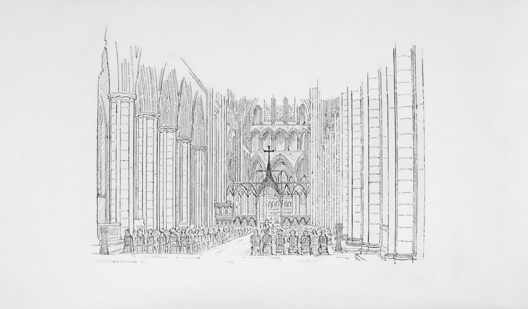
Look closely at a Renaissance interior or an architectural drawing, and the apparent calm of the image rests on a disciplined system. Edges of floors, ceilings, walls, paving stones, and furniture recede toward points organized by the viewer”s eye level. During the Italian Renaissance, artists gradually developed a more systematic approach to this problem, and Leon Battista Alberti codified important principles of linear perspective in 1435. The method transformed the canvas into a theoretical window, allowing objects to become smaller and increasingly foreshortened as they move away from a fixed viewpoint. A useful overview of these historical principles appears in this authoritative account of linear perspective.
The basic vocabulary is practical rather than intimidating. The horizon line represents the viewer”s eye level, even when the horizon itself is hidden by buildings, trees, or hills. A vanishing point is the place toward which parallel lines appear to converge. Orthogonals are the receding lines that lead the eye into the scene, while transverse lines cross them and indicate intervals moving through space. One-point perspective is effective when a subject faces the viewer directly. Two-point perspective becomes more natural when the corner of a building or box turns toward the observer. Three-point perspective is useful for dramatic views looking sharply upward or downward, but it is not required for most landscape and interior studies.
The danger is not incorrect geometry alone. A drawing can obey every construction line and still feel stiff because the artist has mistaken perspective for a cage. Vanishing points are better understood as sight guides. They organize the directional energy of the composition, but they do not dictate every visible contour with equal force. Organic forms bend, surfaces interrupt one another, and the viewpoint may shift subtly as the eye explores a painting. Use convergence to anchor architecture, then allow observation to govern the irregularities that make the scene believable.
- Place the eye level before drawing secondary details.
- Use repeated objects, such as windows, posts, or paving stones, to test whether spatial intervals diminish convincingly.
- Let overlaps clarify which form sits in front of another.
- Check the scale of figures against nearby architectural or landscape landmarks.
- Treat the vanishing point as a directional guide, not a command to force every line into submission.
Perspective also carries expressive meaning. A low horizon can give prominence to the sky and make distant terrain feel expansive, while a high horizon can emphasize the ground, a tabletop, or a nearby architectural structure. The rules are therefore inseparable from viewpoint. For a broader comparison of projection systems and their visual logic, consult this discussion of Wikipedia.
Painting the Invisible Medium of Air and Atmosphere
Linear perspective describes the path of forms through space, but it does not describe the space itself. Between the viewer and a distant tree lies a column of atmosphere. Light travels through that column, encountering particles of moisture, dust, and other matter that scatter some wavelengths and reduce the clarity of the object behind them. The painter does not need to reproduce this physics literally, but understanding its visible consequences is invaluable. Distance tends to make forms paler, cooler, less saturated, and less sharply defined.
Atmospheric color is never a fixed recipe. Under a clear blue sky, distant hills may lean toward blue or blue-violet. In overcast conditions, they may become cooler gray. At sunrise or sunset, the same layers can take on warmer pink, ochre, or lavender passages. The essential point is relational: foreground colors usually carry greater warmth and intensity, while receding colors become more closely related to the surrounding air. Mixing a measured amount of sky color into distant landforms can make them feel enveloped rather than merely painted with a lighter pigment.
Edges provide another remarkably sensitive distance cue. A near tree may have a crisp silhouette, broken bark, and individual leaves. A middle-ground tree can retain its mass while losing small accents. A far tree may merge into a horizontal band of tone. Softening every edge, however, produces mud rather than atmosphere. The most convincing work varies edge control: preserve a few sharper passages where the eye needs to pause, soften contours that turn away or recede, and use broken brushwork to suggest texture without describing every fragment.
The Mechanics of Value Compression and Spatial Planes
Value compression describes the narrowing gap between light and dark as forms move into the distance. A nearby object can contain deep shadows, bright highlights, and a broad range of intermediate notes. Atmospheric distance reduces that range, so the darkest darks rise toward the middle and the lightest lights become less distinct. A distant mountain may still have a recognizable ridge and internal color variation, but its overall value structure may occupy only a narrow band.
One practical progression is to allow four or five distinct value steps in the foreground, approximately three in the next layer, two in the middle ground, and perhaps one or one and a half in the far background. These are not rigid quotas. They are a way to notice whether the distant passage is competing with the subject nearest the viewer. Squinting at the reference or study suppresses distracting detail and reveals the large value masses that should govern the painting before texture is added.
Painter and teacher John F. Carlson”s four-angle approach offers a useful way to organize broad illumination. It distinguishes the sky, the ground plane, upright planes such as trees or walls, and slanted planes such as hillsides, roofs, or banks. Each plane receives light differently, so a coherent landscape depends on more than simply making distant objects pale. The same principle can be applied to graphic representation and visual construction, as discussed in this historical overview of perspective across art history.
| Spatial area | Value behavior | Color and edge behavior |
|---|---|---|
| Foreground | Broadest light-dark range and strongest accents | Warmer, richer, more saturated, with selective hard edges |
| Middle ground | Reduced contrast with readable mass divisions | Moderately cooler and quieter, with mixed edge sharpness |
| Background | Narrow value range, sometimes nearly unified | Cooler or air-colored, less saturated, with softened contours |
Compression does not mean draining a painting of color. A group of hues can share a similar value while differing in temperature and saturation. This allows a distant field, sky, or misty hillside to remain visually alive without breaking the spatial hierarchy. Value carries the structural burden, while hue and saturation provide the quieter rhythms that keep the atmosphere from becoming flat or gray.
A Practical Studio Sequence for Layered Depth
Begin with a light, economical drawing. Establish the eye level, identify the principal vanishing direction, and indicate the largest shapes before describing any surface detail. In a landscape, place the horizon with intention rather than automatically centering it. In an interior, lightly mark the floor, ceiling, and dominant architectural edges. The purpose of this first stage is not to finish the drawing but to confirm that the composition has a believable spatial skeleton.
- Establish the viewpoint. Mark the eye level and place the main convergence guides. Use loose lines to locate the largest foreground, middle-ground, and background masses.
- Block the value structure. Paint or draw the broadest light and dark shapes first. Reserve the strongest contrast and darkest accents for the foreground or focal area, while keeping distant planes within a narrower range.
- Unify structure and atmosphere. Shift distant colors toward the air, soften selected edges, reduce unnecessary texture, and reinforce only those lines that clarify the composition.
During the block-in, work from the general to the particular. A large, simplified tree mass is more useful than a collection of carefully rendered leaves if the value relationship is still unresolved. Similarly, a broad wash for a receding mountain is more informative than a detailed contour that has not yet been integrated with the sky. Grouping forms protects the sense of distance because nature itself often presents faraway objects as connected shapes rather than isolated items.
The final pass should be selective. Add sharper edges where the eye should rest, warmer notes where a form approaches, and small accents that describe scale without scattering attention everywhere. If the painting feels flat, do not immediately add detail. First inspect the temperature sequence, the value range, the spacing between repeated objects, and the overlap of planes. Often the missing depth is a structural or atmospheric relationship, not a shortage of brushwork.
Bring Living Space to Your Easel
A convincing spatial illusion emerges when the two systems support one another. Linear perspective gives the scene an underlying order, directing receding surfaces toward a coherent viewpoint. Atmospheric perspective then makes that order breathe by acknowledging the veil of air between near and far. Without geometry, forms may drift or lose scale. Without atmosphere, they may remain diagrammatically correct but optically stranded on the surface.
Practice both systems through close observation rather than mechanical measurement alone. Study how a row of trees changes size, how a road narrows, how a distant roof loses contrast, and how the same color shifts when it moves from sunlight into haze. On the canvas, build the space in layers, then adjust those layers until structure, light, and air agree. The goal is not to imitate a formula, but to make the painted surface feel like a breathable window through which three-dimensional light continues beyond the frame.