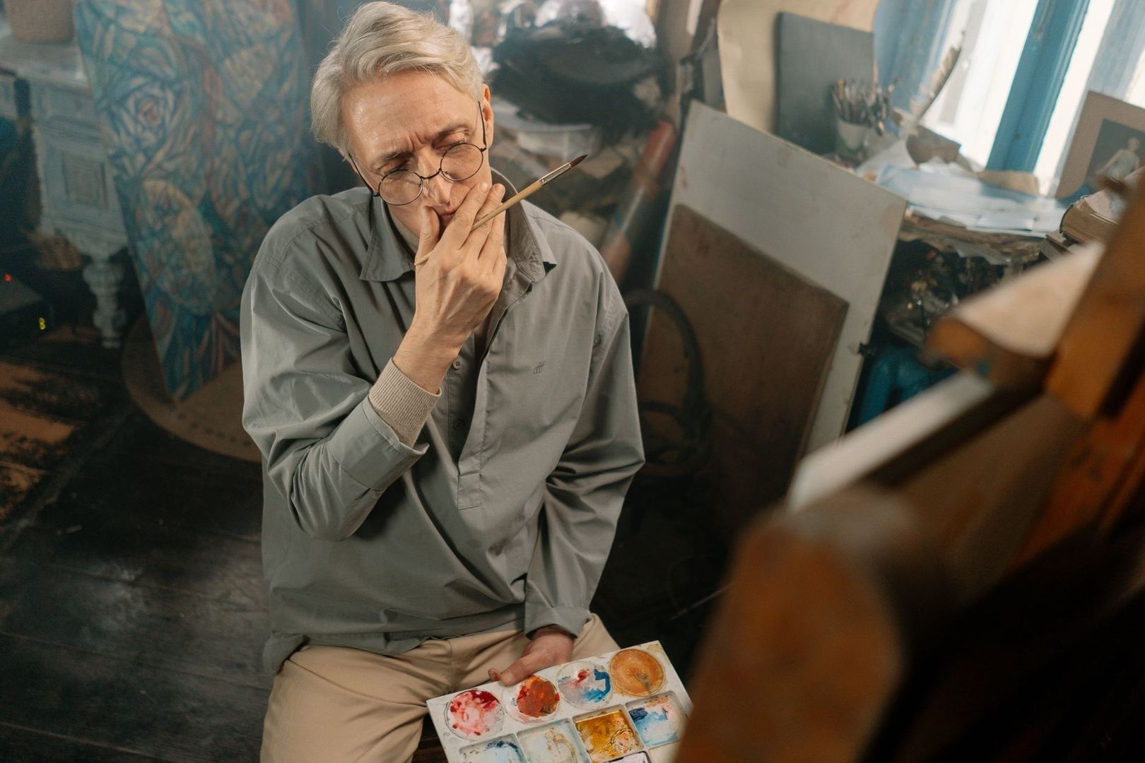
Beyond Surface Mimicry: How to Reverse-Engineer Master Paintings

The Anatomy of Visual Inquiry

A master study becomes transformative at the moment it stops being a polite imitation. Passive copying follows the visible surface, reproducing colors, contours, and small passages as though the painting were a flat image to be transcribed. Active structural deconstruction asks a more consequential question: what sequence of decisions made this image coherent? The painter studies the organization of light, the placement of large shapes, the direction of movement, the hierarchy of edges, and the selective omissions that allow the image to breathe.

Novice painters often become trapped in micro-rendering because detail offers an immediate sense of progress. A carefully described eyelash, fold, or leaf can feel like evidence of diligence, even when the head, figure, or landscape is structurally misplaced. Yet a convincing painting does not begin with isolated facts. It begins with relationships. If the value pattern is weak, the contours uncertain, and the focal area undifferentiated from its surroundings, increasingly refined detail merely polishes an unstable foundation.

Every accomplished painting is a crystallized record of visual problem-solving. Its finished surface conceals decisions about proportion, compression, rhythm, depth, material, and attention. A museum visit can therefore become a form of forensic looking. Rather than asking only what a painting depicts, examine how it organizes perception. This roadmap treats the master copy as a diagnostic instrument, helping self-directed artists inherit a painter”s thought process without borrowing the artist”s identity.

Uncovering Hidden Scaffolding Beneath the Surface

Look closely at a polished painting and the cosmetic finish can seem complete, almost inevitable. Beneath it, however, lies an armature of axes, masses, directional rhythms, and revisions. A hand may have shifted, a shoulder widened, or a head tilted before the final contour settled into place. These changes, known as pentimenti, are not failures concealed by history. They are evidence of active searching, proof that the image was constructed through adjustment rather than delivered fully formed.

Technical examination makes some of this searching visible. Infrared reflectography can reveal underdrawings, repainting, and other information hidden beneath the upper paint layers. Comparative research on infrared reflectography and pulsed thermography shows that the visibility of underdrawing depends not only on the materials involved but also on imaging conditions and signal quality. For the studio artist, the lesson is direct: the apparently effortless surface may rest on a provisional network of lines and shapes that remained flexible while the image developed.

Historical studio practice likewise treated drawing as an architecture of volume. The first marks were not necessarily attempts to perfect an outline. They established proportion, balance, planes, gesture, and the relation of one mass to another. In a contemporary master study, begin by searching for that architecture rather than chasing contour accuracy.
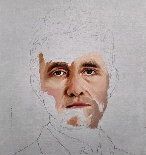
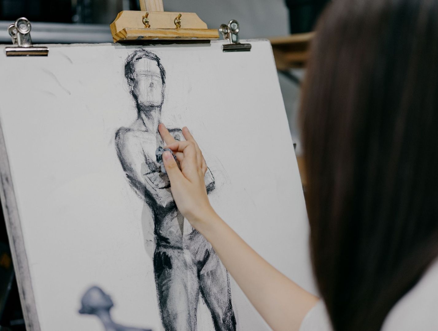
Partially painted portrait study with visible underdrawing and unfinished clothing
A structural study keeps proportion, gesture, and value relationships open long enough for the painting”s larger decisions to be tested.
  • Identify the dominant vertical, horizontal, and diagonal divisions.
  • Reduce the subject to a few interlocking masses before describing its edges.
  • Mark the central axis of figures, heads, limbs, or architectural forms.
  • Trace repeated rhythms, such as aligned shoulders, branches, folds, or gaze directions.
  • Note where the artist allows construction lines to disappear beneath later passages.

This approach turns the copy into a conversation with method. A structured tradition of master study can be explored through historical master study and its broader context on Wikipedia, but the essential practice remains available in any studio: separate the visible result from the decisions that produced it. A limited structural sketch may teach more than a painstaking replica if it exposes why the composition holds together.

Seeing in Values Before Seeing in Details

Before color becomes descriptive, it functions architecturally. A painting”s light and dark shapes establish its weight, depth, atmosphere, and emotional temperature. Tonal massing means grouping related values so that the viewer reads a coherent design rather than a collection of unrelated accents. In a portrait, the shadow side of the head may operate as one broad shape, even though it contains cheek, hair, ear, and neck. In a landscape, distant trees, mountains, and cloud shadows may be compressed into a single family to preserve spaciousness.

Squinting is a simple but powerful diagnostic. When the eyes narrow, small contrasts diminish and the major value families remain. A thumbnail made from this view reveals whether the focal area is genuinely supported by the composition or merely surrounded by busy marks. Value mapping can then clarify the image further by reducing it to three, four, or five tones. The question is not whether every local color has been preserved, but whether the large relationships still carry the subject when detail is removed.

The viewer”s eye moves through a hierarchy, not an equal field of information. Strong contrast, sharper edges, distinctive color, and concentrated detail tend to attract attention. If every passage is equally crisp and dark, the painting loses direction. The following comparison helps distinguish additive rendering from structural massing.

Additive rendering Structural massing
Builds detail before confirming the major pattern Establishes large light and shadow groups first
Treats every object as equally important Creates a clear focal hierarchy
Preserves local changes even when they fragment the image Compresses related values to strengthen unity
Uses edges with similar sharpness throughout Varies lost, soft, firm, and accented edges
Measures success by visible finish Measures success by readable structure at a distance

Stroke economy depends on this foundation. If the large value pattern is correct, a few marks can suggest a surprisingly complex form. If the pattern is wrong, additional brushwork only distributes confusion more elaborately.

The Logic of Stroke Economy and Intentional Marks

Stroke economy is not simply speed, and it is not an excuse for careless execution. It is the ability to make a limited number of marks carry several kinds of information at once: form, light, material, gesture, and atmosphere. John Singer Sargent”s broad passages often describe an entire plane with a single confident movement. Gregory Manchess similarly demonstrates how implied detail can preserve clarity while allowing the surface to remain active. The viewer completes what the brush only suggests.

This economy is easier to understand when compared with photography. A photograph records a dense field of specific information, while a painting can select, suppress, and rearrange. A hand may be indicated by a turn of value and one angular accent rather than a fully modeled inventory of knuckles. Hair can become a directional mass with a few breaks of light. The omission is not a lack of knowledge. At its best, it is evidence that knowledge has been edited.

Many painters resist this editing because precision feels safer. Over-control often disguises anxiety: the fear that a bold mark cannot be corrected, or that a simplified passage will expose insufficient understanding. Yet the goal is not to abandon control. It is to place control earlier, in the decisions about proportion, value, edge, and emphasis, so that the final marks can remain comparatively free. The practical variables described in How to Paint Looser include brush handling, pressure, paint consistency, surface, speed, and the distance at which the brush is held from the ferrule.

  1. Choose a small subject and describe it with ten deliberate strokes, prioritizing gesture, light direction, and the largest color relationships.
  2. Repeat the study with a different brush pressure, observing how a loaded mark and a lightly dragged mark alter the sense of form.
  3. Paint one passage at full speed and another slowly, then compare where energy, softness, or overworking has entered.
  4. Mix only part of each color on the palette or surface so that the stroke retains variation rather than becoming uniformly flat.
  5. Reserve the sharpest and most opaque marks for the focal area, allowing peripheral forms to remain implied.

After each exercise, inspect the result from a distance and ask which marks are doing genuine structural work. A stroke should not survive merely because it is attractive. It should remain because it clarifies the image, directs attention, describes a turn, or contributes to the painting”s rhythm.

A Diagnostic Protocol for Studio Study

A productive master study has a sequence. The purpose is not to reproduce the original as efficiently as possible, but to expose its decisions in a controlled order. Work from a reproduction only when direct museum access is impossible, and remember that scale, lighting, surface, and color reproduction can alter what is perceived. In a museum, follow the institution”s copyist rules, credit the original artist, never reproduce the original signature, and identify the exercise as “after” the master. Ethical clarity is part of serious study.

  1. Begin with a five-minute thumbnail value compression. Use a soft pencil, charcoal, or a broad digital brush. Reduce the painting to three or four value families. Do not draw eyelashes, leaves, buttons, or decorative edges. Test whether the composition remains legible when its descriptive information has been compressed.
  2. Chart linear vectors and the focal path. Draw the principal axes over a separate tracing layer or beside the reference. Mark the direction of limbs, architectural diagonals, gaze lines, horizon divisions, and major curves. Then indicate how these vectors lead the eye toward, around, or away from the focal area.
  3. Create a limited-palette massing study. Select a small number of colors, such as a dark neutral, a warm middle, a cool middle, and a light. Establish the largest shapes before mixing subtle transitions. Watch how edge relationships change when two neighboring masses are close in value or strongly separated.
  4. Perform a selective detail pass. Add only the accents that explain material, focal emphasis, or spatial depth. Compare each proposed mark with the original”s level of emphasis. If a peripheral detail competes with the subject, soften, simplify, or remove it.
  5. Write a process diagnosis. Record what was difficult, which relationships failed first, and where the original solved a problem with economy. This brief analysis prevents the exercise from becoming a decorative imitation and identifies the next technical study.

Museum copying traditions demonstrate why this order matters. The Metropolitan Museum of Art”s copyist program, founded in 1872, reflects a long history of learning directly from paintings, drawings, and institutional collections. The experience of studying original works also reveals practical realities that reproductions conceal: scale, surface texture, viewing distance, gallery lighting, and the physical authority of the object. Even a short sketch in front of an original can expose a structural decision that disappears on a screen.

Consider making several studies at different scales rather than one exhaustive replica. A small value map tests design, a linear diagram tests construction, and a limited-palette study tests color and edges. Together they form a more complete investigation than a single polished copy. The finished study should remain clearly identified as an educational work after the original, never as an independent claim of authorship.

Carrying Ancient Lessons Into Your Own Visual Voice

The deepest purpose of a master study is not to acquire another painter”s mannerisms. It is to discover how that painter selected, organized, simplified, corrected, and finished visual information. Sargent”s economy, Manchess”s implied detail, or the structural discipline of an atelier can become useful principles without turning into costumes. Inheritance is strongest when it occurs at the level of thought rather than surface style.

Apply the extracted principles to subjects that belong to contemporary life: a crowded train platform, a family kitchen, a weathered storefront, or a figure illuminated by a phone screen. Compress the values, chart the movement, control the focal hierarchy, and let the brush marks serve the structure. A gallery visit can then become less like a search for perfect appearances and more like a dialogue with fellow practitioners across time. Look for the choices beneath the finish, test those choices in your own work, and allow the resulting paintings to speak in a voice that is informed, deliberate, and unmistakably yours.
How Light Left the Studio: Understanding Color Temperature Through Plein-Air Painting

Stepping Away from the Bitumen Palette

Before landscape painting became an encounter with weather, many artists worked in the controlled gloom of the academic studio. Illumination was carefully managed, poses were held still, and shadows were often translated into umbers, asphaltum, bitumen, and neutral gray. These dark materials could create gravity and solidity, but they also encouraged a universal brownness, as though every recess in the world belonged to the same interior dusk. A painted shadow became less an observation than a convention.

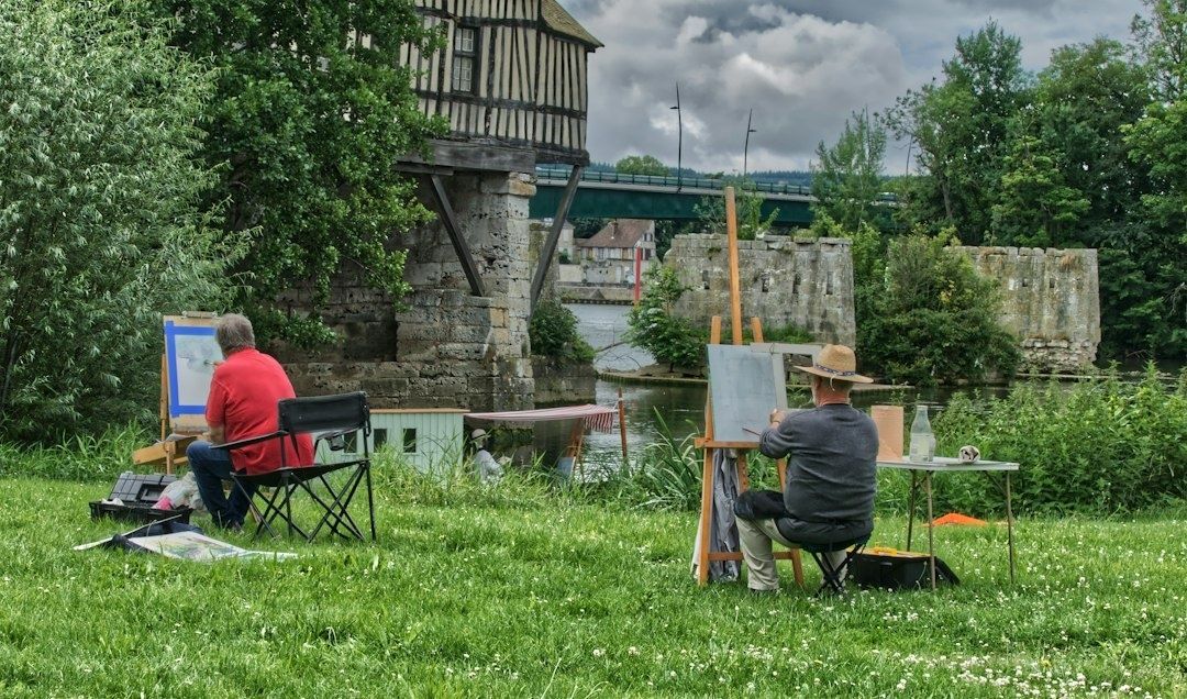
The nineteenth-century decision to carry easel, canvas, and newly portable paint outdoors altered that habit at its foundation. Collapsible metal paint tubes made prepared colors easier to transport and preserve, while lighter equipment allowed artists to stand directly before a field, river, street, or hillside. As the history of painting en plein air makes clear, this was not simply a change of location. It transformed color temperature from an academic formula into a living perceptual science, governed by the continual exchange between warm sunlight, cool sky light, reflected color, and moving atmosphere.

The Great Escape into Daylight

Portable materials did not create the desire to paint outdoors, but they made sustained outdoor observation far more practical. Earlier artists had made studies in the open air, yet the combination of manufactured paint tubes, compact easels, and transportable palettes gave landscape painters a new freedom. Instead of remembering a view after returning to the studio, an artist could watch the scene change while the brush was still moving.

The cultural effect was considerable. Working directly before the motif encouraged painters to value immediacy, local color, and the evidence of a particular hour. A tree was no longer merely “green,” and a road was not simply “brown.” Each depended on season, weather, reflected surfaces, and the direction of the sun. Plein-air practice also made the artist more visibly present in the landscape. The painting became a record not only of a place, but of a temporary encounter with it.

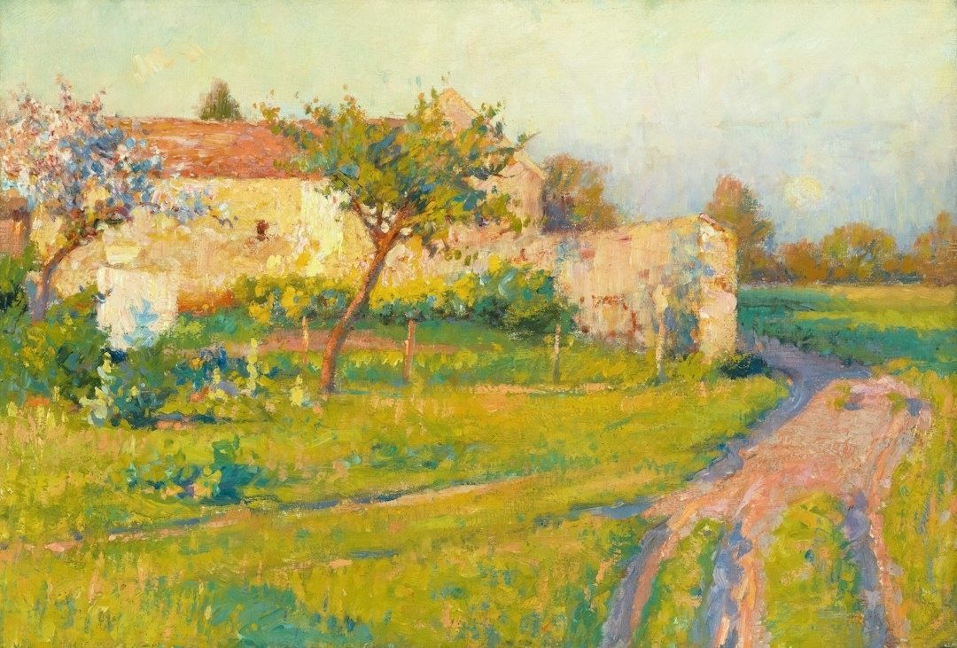
Sunlit impressionist countryside with a winding dirt path and orchard
Painting outdoors trains the eye to recognize how changing light reshapes color, depth, and atmosphere from one moment to the next.

Indoor illumination tends to remain relatively stable, even when it is imperfect. Natural light is restless. Clouds soften and cool a field; a break in the weather suddenly warms it; pale walls reflect sunlight into shadow; water lifts fragments of blue or green into nearby forms. Outdoors, the painter must continually compare one passage with another rather than assign isolated labels to colors.

  • Studio light is usually controlled, directional, and comparatively consistent.
  • Daylight combines direct sunlight with diffuse illumination from the sky.
  • Outdoor color changes with time, weather, season, atmosphere, and reflected surroundings.
  • The same pigment can appear warmer or cooler according to the colors placed beside it.

That attentiveness remains central to plein-air painting today. The practice is less about copying every visible detail than about recognizing which relationships make the scene feel illuminated. A landscape painter such as Jackie Jones, whose approach emphasizes observation, atmosphere, and carefully balanced color, demonstrates how outdoor work can join structured design with a responsive, poetic sense of place.

The Optical Mystery of Blue Shadows

Look at a sunlit wall and its adjacent shadow. The shadow may appear blue, violet, or greenish, even when the material itself is warm stone or ochre plaster. In a studio tradition shaped by umber and black, this could seem surprising. Yet the outdoor effect follows a clear distribution of light. The sun supplies direct illumination, while the open sky supplies a broad field of indirect, bluish light.

When direct sunlight falls on a surface, its warmth dominates the lit plane. Where an object blocks that sunlight, the shadow is not necessarily empty of illumination. It receives light scattered through the atmosphere and light reflected from the sky. Because the sky”s visible light is commonly biased toward blue, the shadow can inherit that cooler influence. The result is not a fixed rule that every shadow must be blue, but a perceptual relationship between the warmth of the light and the relative coolness of the shade.

What the eye observes Likely color influence
Direct sunlight on a pale surface Warm yellow, orange, or golden influence
Open sky illuminating a cast shadow Cool blue or violet influence
Grass reflected into a nearby wall Green influence in the lower plane
Sunset light across the whole scene Warmth in both light and shadow, with relative contrast remaining important

Atmospheric scattering deepens this effect. Shorter blue wavelengths are dispersed through the atmosphere, which helps explain the sky”s color and its influence on outdoor surfaces. Complementary contrast also intensifies perception: a warm sunlit passage can make a neighboring cool shadow appear more distinctly blue, while the cool shadow can make the light seem more orange.

The most useful lesson is contextual. A shadow should not be painted blue because a rule demands it. It should be compared with the light around it. In a cloudy landscape, the difference may be subtle. Under a clear midday sky, it may become vivid. At sunrise or sunset, shadows can themselves appear warm, although they may still be cooler than the strongly illuminated planes. Outdoor observation replaced generalized studio convention with this more precise question: cooler or warmer than what?

Rethinking the Warm and Cool Dichotomy

Color temperature is relative rather than absolute. Red, orange, and yellow are conventionally described as warm, while blue, green, and violet are generally described as cool. But a painting is not organized by isolated categories. A lemon yellow that leans toward green may feel cooler than an orange-leaning cadmium yellow. A violet blue may appear warmer than a greenish blue. Temperature emerges through comparison, lighting, and surrounding color.

The question of ultramarine makes the point especially well. Some painters experience it as a cool blue because it belongs to the blue family; others classify it as warm because its violet tendency brings it closer to red. Cobalt may occupy a more central position, while a blue that leans toward green or violet shifts in a different direction. Neither judgment needs to be treated as a permanent scientific verdict. The practical issue is how a pigment behaves within a particular mixture and visual setting.

  • Compare colors side by side instead of judging them from memory.
  • Notice whether a pigment leans toward a neighboring hue on the color wheel.
  • Keep warm and cool versions of the primaries available for cleaner mixtures.
  • Judge the temperature of a shadow against its light, not against an abstract color chart.
  • Remember that adding white can lighten a color while also making it appear cooler or chalkier.

This logic explains the usefulness of a split-primary palette. A painter may keep a warm and cool yellow, a warm and cool red, and a warm and cool blue, then select among them according to the atmosphere being observed. Such an arrangement does not impose a rigid formula. It expands the number of relationships available, allowing a sky, reflected field, distant hill, or sunlit wall to be matched with greater sensitivity. The palette becomes a map of possible temperatures rather than a row of permanent identities.

How Nineteenth-Century Innovators Remade the Palette

Nineteenth-century landscape painters increasingly resisted the heavy reliance on black and muddy earth tones when those colors obscured the vibration of daylight. Their aim was not brightness for its own sake. It was to translate the way light appears to tremble across foliage, water, masonry, and air. Instead of mixing every shadow into a neutral dark, painters could place related but distinct colors beside one another, allowing the eye to blend them at a distance.

This approach connected practical observation with broader ideas about perception. Goethe”s color investigations emphasized the interaction of light and darkness, the psychological force of color, and the role of atmospheric conditions in what becomes visible. His attention to boundaries between light and dark helps explain why outdoor color often feels most active at transitions: along a roofline, beneath a branch, or where a sunlit bank meets a cool recess. The revolutionary techniques associated with Impressionism, described through educational resources such as the National Gallery of Art”s history of Impressionism, demonstrate how these observations altered modern painting methods.

For museum visitors, this history, supported by an Authoritative Source, changes the way a gallery wall can be read. A seemingly casual brushstroke may carry a precise temperature: a violet note preserving the coolness of a shadow, a yellow fragment enlivening reflected sunlight, or a green mark preventing a gray road from becoming lifeless. Vibrant pigments and broken brushwork were not merely decorative innovations. They were attempts to make the painting behave like perception itself, where color is registered through relationships rather than isolated facts.

Look at the Shadows on Your Morning Walk

Plein-air painting is not merely a studio technique transferred outdoors. It is a discipline of attention that can train everyday sight. On a morning walk, notice where sunlight strikes pavement directly and where buildings or trees interrupt it. The lit concrete may carry a pale warmth, while the neighboring shadow receives blue from the open sky. A dark doorway may contain reflected green from nearby foliage. These shifts are often quiet, but they are what give an ordinary street its atmosphere.

Try the same exercise with snow, where cool sky light can become unmistakable, or with leaves during golden hour, when warm illumination passes through translucent edges while deeper foliage remains relatively cool. Look for the exact moment when a color changes because its light source changes. Natural daylight is not a fixed spotlight but an ongoing dialogue between direct warmth and ambient coolness, between surface color and reflected atmosphere. Once that dialogue becomes visible, paintings of the open air begin to reveal not only where they were made, but how carefully their artists learned to see.

The Solitary Studio Mirror: How to Audit Your Own Drawings Without an Instructor

Breaking the Illusion of the Familiar Canvas

After several uninterrupted hours in the studio, a drawing can begin to look correct simply because it has become familiar. The eye stops examining the image as a set of relationships and starts recognizing it as an object under construction. This visual adaptation is especially persuasive in solitary practice, where no instructor interrupts the process with a fresh observation. A misplaced shoulder, a drifting axis, or a value that has grown too dark may remain unnoticed because the artist has looked at the same marks for too long.

Independent practice therefore needs deliberate interruptions rather than passive staring. A reliable mirror drawing exercise can translate the corrective spirit of the atelier into a private studio habit, while distance, defocused vision, and photographic checks offer additional perspectives. These tools do not replace judgment. They make judgment more alert by changing the conditions under which the drawing is seen.

The Mirror as an Uncompromising Critic

A handheld mirror is one of the simplest and most revealing diagnostic instruments available to a draftsman. Hold it beside the drawing and view the image through the reflection, or place the mirror at an angle so the reversed drawing appears clearly. Within seconds, familiar lines lose their authority. A head that seemed upright may lean, two eyes may sit on subtly different slopes, or the central axis of a torso may drift away from the supporting pelvis. The reversal exposes these discrepancies because the eye is no longer reading the drawing through the memory built during its creation.

This effect is cognitive as much as optical. When a drawing is viewed repeatedly in its original orientation, the brain becomes efficient at recognizing its intended subject. Recognition can override observation. Reversal interrupts that recognition and returns the image to a more unfamiliar arrangement of shapes. The exercise resembles the broader educational value of mirrored drawing activities, in which mirrored gestures and reflected forms encourage attention to line, mass, rhythm, and dominant elements rather than to a preconceived object.

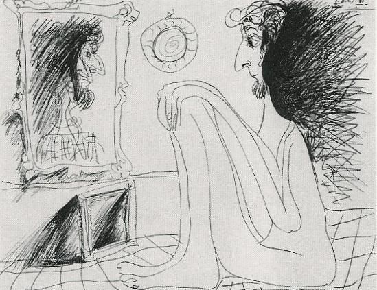
Sketch of a long-haired artist studying a portrait in a studio mirror
A deliberate change in viewpoint interrupts visual familiarity, helping artists evaluate proportion, alignment, and structure with greater objectivity.

Use the reflection as a brief audit rather than a theatrical reveal. Check one structural question at a time:

  1. Reflect the drawing and identify the first major error that becomes visible, such as a leaning centerline or uneven shoulder line.
  2. Compare the largest proportions, including the height-to-width relationship of the head, the length of the rib cage, and the position of the pelvis.
  3. Trace the primary axes with your eye, asking whether the head, sternum, navel, knees, and feet form a coherent directional flow.
  4. Return to the original view and correct only the most consequential discrepancy before checking the mirror again.

The mirror is particularly useful for anatomy because the body depends on alignment even when it is asymmetrical. It does not demand perfect bilateral symmetry. Instead, it reveals whether an asymmetry appears intentional and supported by the pose, or whether it results from gradual drift. A five-second reflection check can expose more than another twenty minutes of concentrated rendering.

Optical Compression Through Distance and the Squint

Fine detail has a seductive presence. Individual eyelashes, fabric folds, hatch marks, and surface textures can make a drawing feel advanced while the larger arrangement remains unstable. Squinting counters this attraction by softening focus and compressing visual information. The precise edges recede, while broad masses of light and dark become more prominent. The drawing can then be judged as a composition before it is judged as a collection of descriptions.

Step back five to ten feet, depending on the size of the work and the available studio space. Half-close the eyes without straining, or allow the gaze to rest slightly beyond the paper. Notice which shapes remain legible. A successful silhouette should retain its essential character, and the dominant value pattern should still organize the image. If the figure dissolves into disconnected fragments, or if every region carries equal contrast, the drawing may need structural or tonal simplification.

Before returning to surface detail, use this checklist:

  • Can the subject be recognized from its outer contour alone?
  • Is there a clear hierarchy between the lightest lights, middle tones, and darkest darks?
  • Do the largest shadow masses read as connected forms rather than scattered patches?
  • Does the focal area receive the strongest useful contrast, or is attention pulled toward an accidental edge?
  • Are the background and subject sufficiently differentiated in value?
  • Does the drawing still communicate its pose or spatial design when viewed at a small scale?

Squinting should not become a substitute for close observation. It is a second opinion, useful at intervals throughout the session. Looking closely reveals edges and transitions; looking through softened vision reveals hierarchy. The most dependable tonal decisions survive both views. If a delicate passage works only at a distance of six inches, it may be functioning as texture rather than form.

Tools of the Diagnostic Atelier Kit

The traditional studio often relied on modest observation aids rather than elaborate technology. A mirror, a darkened reflective surface, a sighting device, and a change of distance could all interrupt habitual seeing. Modern artists can adapt these methods without turning the studio into a laboratory. Each tool is valuable because it isolates a different category of error, from proportion and perspective to tonal imbalance and compositional confusion.

Tool Best diagnostic use Typical flaw revealed
Handheld mirror Reversing the entire image quickly Slant bias, uneven proportions, anatomical misalignment
Claude glass or black glass Reducing the scene to simplified dark and light relationships Weak value grouping, excessive detail, confused focal hierarchy
Digital photograph Creating distance and viewing the work on a neutral screen Perspective skew, cropping problems, inconsistent edges and scale
Physical distance Testing silhouette and large-shape rhythm Fragmented composition, weak gesture, disconnected masses

A Claude glass, traditionally a small darkened convex or flat reflective device, can be understood today as a way of simplifying the visual field. A piece of black glass or a heavily tinted reflective surface reduces local color and detail, allowing the artist to inspect broad value relationships. It is not necessary to treat the device as historically sacred. Its usefulness lies in the perceptual reduction it creates. When the image becomes quieter, tonal structure becomes easier to discuss.

A digital photograph offers a different kind of distance. Photograph the drawing straight on, avoiding a steep camera angle, then view the image at thumbnail size or flip it horizontally. The screen removes the physical scale and studio context that may have influenced the original judgment. It can expose a page that is subtly trapezoidal, a horizon that rises unexpectedly, or a focal point that has become too centered. Perspective deserves particular attention: as lessons in perspective drawing demonstrate, inconsistent horizon levels and vanishing relationships can make a solid object appear tilted, sinking, or unstable. The purpose is not to obey rules mechanically, but to know whether a rule has been broken deliberately.

Building an Active Self-Audit Workflow

Self-critique becomes most effective when it is scheduled before fatigue turns it into an emotional reaction. Establish a pause every twenty minutes during a sustained drawing session. The interval is long enough to produce meaningful work but short enough to prevent complete visual adaptation. At each pause, leave the chair, change the viewing distance, and allow the eyes to reset before deciding what needs attention.

  1. At the first pause, inspect the mechanical structure: placement, proportion, gesture, perspective, and the relationship between major axes.
  2. At the second pause, use the mirror or a horizontal digital flip to locate asymmetry, slant, and proportional drift.
  3. At the third pause, step back and squint, judging the silhouette, value masses, focal hierarchy, and overall visual rhythm.
  4. At the final pause, examine edge quality, asking where contours should be sharp, softened, lost, or selectively emphasized.

This sequence moves from construction to interpretation. Early in the drawing, line placement and proportion deserve priority. Later, tonal balance and edge control determine whether the forms feel convincing. A common independent-practice mistake is to refine the wrong category at the wrong time, polishing a hand while the arm remains too short or deepening a shadow before the main light direction is secure. Structured pauses protect the drawing from this misplaced effort.

Emotional detachment does not mean becoming indifferent to the work. It means treating each mark as evidence rather than as a verdict on personal ability. Record observations in neutral language: “the left shoulder sits too high,” “the shadow mass breaks at the cheek,” or “the darkest accent competes with the face.” Such statements are actionable. “The drawing is bad” is not. The aim is the kind of attentive curiosity encouraged by reflective studio exercises, where artists identify dominant and subordinate elements and use that analysis to guide the next decision.

It can help to keep a small audit log beside the easel. Note the date, subject, three observations, and one correction to attempt. Over time, repeated entries reveal recurring habits. Perhaps contours become too dark too early, figures consistently lean in one direction, or backgrounds are left too close in value to the subject. These patterns are valuable because they transform vague frustration into a personal curriculum.

Cultivating the Independent Eye in Daily Practice

Mistakes become productive when they are treated as diagnostic data. A reversed image may reveal a habitual slant, a squinted view may expose an undifferentiated value field, and a photograph may show that perspective has shifted across the page. None of these discoveries invalidates the drawing. They identify the next area of attention. In a solitary studio, that shift in attitude is essential because progress depends less on constant reassurance than on accurate information.

Build the checkpoints into the next session before the first line is drawn. Set a timer for twenty minutes, keep a mirror within reach, reserve a clear place several feet from the work, and photograph the drawing at the end. Check structure first, then mass, then edges. With repetition, these actions become less like emergency corrections and more like ordinary looking. The independent eye grows through that rhythm: observe, interrupt familiarity, identify the evidence, and make one deliberate adjustment.

Before Detail: How Mastering Value Scales and Planar Lighting Builds Real Form

The Architecture of Light on Form

Many drawings become busy before they become solid. The artist adds a polished highlight to the cheek, a pattern to the fabric, or a soft gradient across a shoulder, yet the underlying mass remains uncertain. This happens when value is treated as a cosmetic rendering stage rather than as the structural blueprint of the image. Before surface detail can persuade the eye, the drawing must establish what turns toward the light, what turns away, and how each part occupies space.

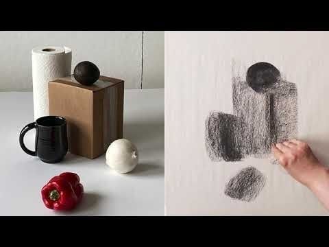
Early embellishment cannot compensate for undefined geometry. Soft blending may produce an attractive atmosphere, but without a clear volumetric plan it often dissolves the planes that make a form legible. A more reliable approach begins with measured tonal relationships and deliberate lighting decisions. In that sense, value is not simply lightness or darkness on paper. It describes physical mass, the orientation of a surface, and the spatial clarity that allows a viewer to feel the object rather than merely recognize its outline. Even a simple study of an egg or folded cloth can benefit from the same discipline found in a carefully constructed value scale exercise.

Calibrating the Palette with Measured Value Scales

A value scale is often dismissed as a beginner”s warm-up, but it is more accurately understood as a calibration instrument. It trains the eye to distinguish neighboring tonal steps and trains the hand to reproduce those distinctions consistently. A well-made scale gives the artist a private reference system: it clarifies how dark the medium can become, how bright the paper can remain, and how evenly the intermediate values can be arranged. This is especially important because graphite, charcoal, ink, and digital tools each compress or expand the available range in different ways.

Constructing a scale also exposes habits that remain hidden in a finished drawing. Uneven jumps between tones reveal where contrast is being overused, while noisy patches indicate uncontrolled pressure or texture. A nine-step scale, associated with the system developed by Denman Ross in 1907, offers fine tonal distinctions, but a smaller range is often more useful during a structural block-in. Five values can be enough to describe a rounded object clearly: light, light halftone, middle, shadow, and deepest accent. As control improves, additional steps can be introduced without allowing the drawing to become muddy.

Think of the scale as a limited palette rather than a catalogue of every possible gray. Restriction creates hierarchy. When every area receives a different strength of shading, the eye has difficulty deciding what matters. A disciplined five-to-nine-step range keeps major light and shadow families intact, then reserves the darkest tones for structural emphasis. Useful principles include:

  • Set the lightest and darkest values before filling the middle range.
  • Space intermediate tones so that each step is visibly distinct.
  • Keep the darkest value selective rather than spreading it across the drawing.
  • Compare the drawing to the scale frequently instead of trusting memory.
  • Use smooth, controlled marks where a continuous surface is intended, and sharper transitions where a plane changes.

The value scale is therefore both a seeing exercise and a planning device. Before beginning a portrait, still life, or figure, decide whether the image will remain high-key and delicate or move toward a dramatic full range. Such a decision prevents accidental tonal drift. It also saves time, because the artist can solve the range and hierarchy before committing to complicated textures or local color.

Planar Analysis and the Structural Planes of Light

Look closely at an organic form and its apparent smoothness begins to reveal a sequence of turns. A cheek moves from front plane to side plane; a pear narrows through a series of subtle changes in direction; a folded sleeve breaks into ridges, troughs, and broad transitional surfaces. Planar analysis makes these changes visible by temporarily translating complex curves into connected, intentional planes. This does not mean making every subject look mechanical. It means asking where the surface changes direction and how that change alters the light.

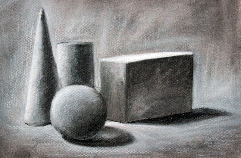
Graphite study of a cone, sphere, and block with cast shadows
Reducing a subject to a few directional planes helps the artist predict how light will organize the entire form. This structural reading keeps later shading from becoming a collection of disconnected patches.

The physics is direct. A plane facing the primary light source receives more illumination than a plane turned obliquely away from it. A plane facing away enters the shadow family, while a plane angled toward the ground may become darker even when it remains close to another illuminated surface. The following comparison is not a rigid formula, since light size, reflectivity, and surrounding surfaces matter, but it provides a practical starting structure:

Plane orientation Likely light response Useful value assignment
Directly facing the light Strong illumination and possible highlight Lightest value or light halftone
Turning slightly from the light Reduced illumination with clear form change Middle-light value
Side-facing or oblique plane Moderate illumination and stronger modeling Middle value
Turning decisively away Entry into the form-shadow family Shadow value
Occluded plane or contact area Little direct light, often reinforced by surrounding blockage Deepest accent, used sparingly

In practice, begin with large planes rather than small anatomical or decorative information. A toy dinosaur, plaster cast, shoe, fruit, or folded cloth can all be studied this way. Establish the silhouette, identify the main directional changes, and assign broad values before refining the form. This analytical stage may initially feel less expressive than free shading, but it gives the drawing a dependable skeleton. Later marks can soften, exaggerate, or partially conceal the planes without losing their underlying logic.

The Anatomy of Edges in Communicating Spatial Volume

Edges are not merely borders; they are signals about how surfaces meet and how attention moves through an image. A hard edge is crisp and decisive, often useful where two planes intersect or where a cast shadow has a clear boundary. A firm edge is controlled but slightly less severe. A soft edge spreads the transition across a small area, supporting a rounded turn. A lost edge becomes so close in value to its surroundings that the boundary nearly disappears, allowing the viewer to infer the form rather than receiving every contour explicitly.

Edge quality should follow the behavior of the form. A box can carry several hard or firm transitions because its planes change abruptly. An egg requires broader, quieter gradations because its surface turns continuously. A cast shadow may begin with a relatively firm edge near the object and become softer as it travels across the ground, depending on the size and distance of the light source. Value contrast also affects perceived sharpness: neighboring shapes with similar values produce a subdued boundary, while a strong light-dark difference makes the edge appear more prominent.

Uniform outlines flatten a drawing because they give every boundary equal authority. They prevent the viewer from distinguishing between a plane intersection, a turning contour, a distant edge, and a shadow boundary. A more articulate edge vocabulary might include:

  • Hard edges for plane breaks, sharp cast shadows, and focal accents.
  • Firm edges for clearly described contours that remain integrated with the form.
  • Soft edges for gradual curvature and atmospheric transitions.
  • Lost edges where form recedes, values merge, or attention should be released.

Edge control is especially valuable in drawings with limited color, because it creates variety without requiring additional hues. A soft graphite transition can describe the turning of a forehead, while a narrow dark accent can clarify the meeting of a handle and a cup. The goal is not to blur everything that is rounded or sharpen everything that is structural. The goal is to make the viewer feel the rate and direction of each change in surface.

A Methodical Workflow for Building Form Before Detail

A dependable workflow postpones texture until the drawing can survive without it. This order resembles the way a sculptor establishes a mass before carving small features. Planar analysis is useful here because it can organize both observation and invention, whether the subject is a figure, animal, object, or imagined design. Work from large relationships toward small ones, and judge every later decision against the initial light structure.

  1. Block in the major spatial silhouettes. Establish the outer contour, the largest internal divisions, and the position of the object in its surrounding space. Choose a single primary light source and keep its direction consistent.
  2. Group the major light and shadow families. Use flat local values to separate illuminated planes from form shadows and cast shadows. Resist the urge to model every transition immediately.
  3. Refine secondary planes and turning forms. Introduce intermediate values where a surface rotates gradually. Use hard, firm, soft, and lost edges deliberately so that the drawing communicates both structure and depth.
  4. Introduce selective texture at focal transitions. Add pores, fabric marks, wood grain, metal reflections, or other surface information only after the form and lighting remain convincing in simplified form.

At each stage, step back and reduce the image mentally to a thumbnail. If the large light and shadow pattern still reads, the construction is working. If the drawing depends on tiny accents to appear dimensional, return to the previous stage and repair the major value relationships. Texture has its own visual language, but it cannot replace structure. Leather, skin, metal, and fabric become believable only when their marks follow a surface that already turns convincingly through space.

A useful test is to squint at the drawing or view it at a distance. Fine details should disappear while the primary masses remain. Another test is to convert the study into five values, either physically or digitally. This reduction reveals whether the focal point is supported by contrast and whether the shadow family has been kept coherent. Such checks may seem methodical, but they protect the drawing from the seductive noise of premature finish.

Bring Sculptural Mass to Your Daily Sketchbook Practice

The essential shift is from cosmetic shading to architectural lighting. Instead of asking which mark will make a surface look interesting, ask which plane is turning, which value family it belongs to, and how the edge should behave at that transition. This mindset does not eliminate expressive mark-making or material specificity. It gives those qualities a stable stage on which to act.

For regular practice, choose simple household forms such as an egg, mug, box, shoe, or folded towel. Draw each one with only five values under a single lamp. First map the silhouette and cast shadow, then divide the form into broad planes, then adjust edge quality. Repeat the exercise from a different light direction or with the object rotated. Over time, this practice builds more than technical accuracy. It develops confidence in the decisions that make a drawing feel solid before the viewer notices its surface.